Gmail uses The Drag & Drop Object Pattern to “Make It Direct”
Principle #1: Make it Direct
In the earlier version of Gmail, the only way to label or organize messages was to select the row or rows, then navigate to the “Move To” combo box or “Label” combo box.
But last week (at least in my Gmail account) Google decided to Make It Direct. Why select a row and look for an action button somewhere- just grab that message and drag it!
The Drag and Drop Object Pattern, in Chapter 2 of our book explains the nuances involved in this pattern such as affordance- ie. letting the user know they can drag something to reorganize the relationship, and clearly indicating the available drop zone.
Affordance
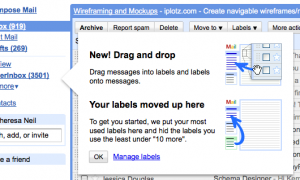
Gmail introduces the feature with a well designed help tip:
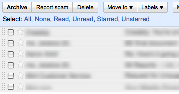
And by visually indicating the messages can be moved by displaying a drag handle on each row:
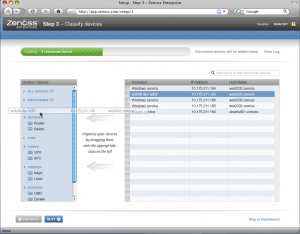
We did something similar in the new design of Zenoss, an open source systems management application. On Step 3 of Set-Up, the systems administrator can efficiently organize their infrastructure by dragging devices (right) into the proper category (shown on left).
Since this is a set-up screen folks will only use once, we decided to embed the instructions in the screens instead of using a dialog with the tip.
Drop Zone
Although Gmail did a nice job introducing the feature, they didn’t implement the standard cursors for drop zones:
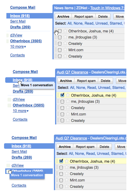
Typically, the cursor should provide feedback when hovering over different zones, showing the user where the object can or can’t be dropped:
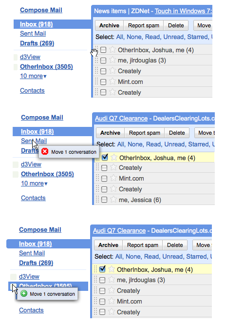
The Ajax framework Ext JS handles this perfectly right out of the box- click to watch the screencast.
Expandable Drop Zone
So does this mean I have to go click to expand to see ‘12 More’ before I can drag any messages into those folders? Nope- Gmail borrowed an slick interaction from the Mac – the Expandable Drop Zone.
Now in Gmail, you can select one or more messages, drag them to an expandable drop zone, and a layer opens dispalying all of the other labels. Bill mentioned to me that a slightly longer delay ‘on drop’ would help provide feedback that the messages actually ended up in the right label.

Bill Scott Said,
July 12, 2009 @ 1:38 pm
Another minor nit with the current interface is the “Tiny Target” antipattern in operation here. The “drag initiation area” is very small. You have to position your mouse over the dimples. They don’t light up indicating they are available for interaction (lack an invitation) and they are hard to target (tiny target).
Francisco Said,
July 16, 2009 @ 1:03 am
nice pattern and nice interaction.
Marcel Said,
July 27, 2009 @ 2:10 am
Good Article! i love the book.
Ext JS is a good one, but be careful in spezification. it’s good (nearly excellent) if you follow the main Framework and do not integrate too many custom interactions. in that case Ext JS is (on my experience) hard to handle..