Design Beautiful & Usable Android Apps

Here are some excellent resources if you are designing for Android Gingerbread or Ice Cream Sandwich.

Galleries

Pattern Libraries

Stencils/Templates

  • Zurb’s excellent OmniGraffle Stencil
  • Android 4.0 PSD
  • High Density PSD from Teehan + Lax, June 2011
  • Stencil for Visio- Nope can’t find one. I’ll say it again, the Visio community needs to get it together and starting making high quality stencils and sharing them. If you know of a Visio stencil for a current version of the Android OS, please comment and share.
  • Keynotopia for prototyping. I have bought and used this bundle for iPad prototyping and it works well. I haven’t tried it for android apps yet.
  • Glypish Icons are really useful for low and high fidelity mockups
  • User Interface Design Guidelines

    Android Design

    Blogs/ Articles

    Books

    Presentations & Videos

    Comments off

    Screen Layouts for Rich Internet Applications

    Last year we posted an article on 12 Standard Screen Patterns. It has been incredibly popular so we updated it for 2010. The full article will be published at UX Magazine. In the meantime, take a look at the 15 standard layouts and examples from more than 80 current RIAs:

    Comments (14)

    Designing for Interesting Moments Talk

    I posted this on my personal blog and according to slideshare it is the top tweeted presentation from their site today (9/20/09). Been meaning to post it here for those who don’t follow my blog. The material contains some new examples but tracks with the book’s six principles.

    I recently gave this talk at Microsoft for their UX team, at the Ruby Meetup Group at the CMU campus in the bay area and most recently at the Ajax Experience in Boston. Next time I will be giving this talk is in December at the Rich Web Experience (first week of December) in Orlando, Florida.

    Comments (1)

    Gmail uses The Drag & Drop Object Pattern to “Make It Direct”

    Principle #1: Make it Direct

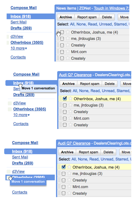
    In the earlier version of Gmail, the only way to label or organize messages was to select the row or rows, then navigate to the “Move To” combo box or “Label” combo box.

    But last week (at least in my Gmail account) Google decided to Make It Direct. Why select a row and look for an action button somewhere- just grab that message and drag it!

    The Drag and Drop Object Pattern, in Chapter 2 of our book explains the nuances involved in this pattern such as affordance- ie. letting the user know they can drag something to reorganize the relationship, and clearly indicating the available drop zone.

    Affordance

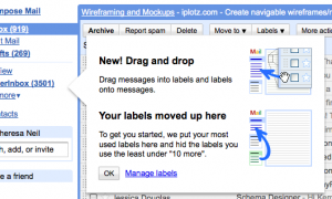
    Gmail introduces the feature with a well designed help tip:
    google-tip1

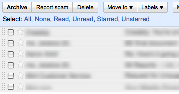
    And by visually indicating the messages can be moved by displaying a drag handle on each row:
    gmail_drag-handle

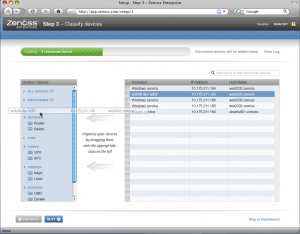
    We did something similar in the new design of Zenoss, an open source systems management application. On Step 3 of Set-Up, the systems administrator can efficiently organize their infrastructure by dragging devices (right) into the proper category (shown on left).

    drag_drop_reorg_zenoss

    Since this is a set-up screen folks will only use once, we decided to embed the instructions in the screens instead of using a dialog with the tip.

    Drop Zone

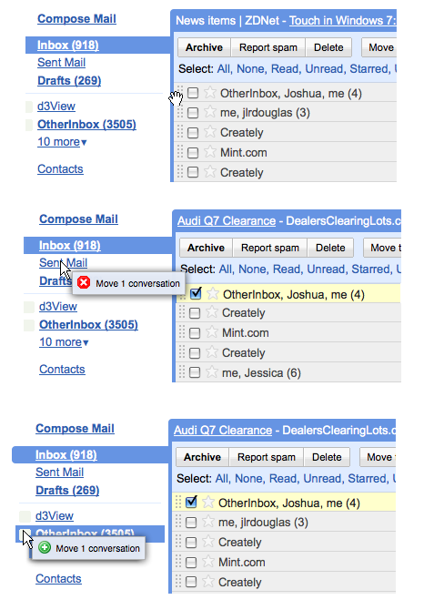
    Although Gmail did a nice job introducing the feature, they didn’t implement the standard cursors for drop zones:
    drag_drop_gmail1

    Typically, the cursor should provide feedback when hovering over different zones, showing the user where the object can or can’t be dropped:
    drag_drop_revise

    The Ajax framework Ext JS handles this perfectly right out of the box- click to watch the screencast.

    Expandable Drop Zone

    So does this mean I have to go click to expand to see ‘12 More’ before I can drag any messages into those folders? Nope- Gmail borrowed an slick interaction from the Mac – the Expandable Drop Zone.

    Now in Gmail, you can select one or more messages, drag them to an expandable drop zone, and a layer opens dispalying all of the other labels. Bill mentioned to me that a slightly longer delay ‘on drop’ would help provide feedback that the messages actually ended up in the right label.

    Comments (3)

    Excellent Roundup of Pattern Resources (Smashing Magazine)

    Smashing Magazine Article

    Smashing Magazine did an excellent roundup of pattern & screenshot gallery resources.

    Check out their article 40+ Helpful Resources On User Interface Design Patterns.

    One missing as of this writing is The Design of Sites book site. If you don’t have the book The Design of Sites I recommend it.

    Comments off

    Two Anti-Patterns: Geek Speak & Needless Fanfare

    Over on my other blog (looksgoodworkswell) I posted two examples of Anti-Patterns that relate to our book.

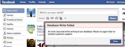
    The first is Geek Speak. Presenting the user with jargon they will not understand (usually when something goes wrong deep in the bowels of the software). This example is from Facebook.

    facebook-database-error (by Designing Web Interfaces)

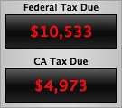
    The second is an example of Needless Fanfare (which we write about in the book). Unnecessary animation/transitions that instead of reinforcing communication needlessly distract from the job at hand. Turbo Tax weighs in with their version of the Biggest Loser scale when they recalculate your taxes on the fly.

    Needless Fanfare - Turbo Tax Suspenseful Recalculation (SloMo) Read the full discussion on Geek Speak and Needless Fanfare over on my blog.

    Comments (10)

    6 Tips for a Great Flex UX: Part 3

    By Theresa Neil

    Since the book focuses on rich interactions, I want to spend some time on Adobe Flex/AIR.

    These tips are based on the best Flex resources I have found, and how you can use them to craft a great user experience. This is part 3 of 6:

    Learn from the Rest: 10 Great RIAs

    Take a look at some of the best RIAs on the web. How did I decide these are the best? I reviewed numerous applications, basing the evaluations on Jakob Nielsen’s 10 Principles for User Interface Design:

    Feedback — Metaphor — Navigation — Consistency — Prevention — Recognition — Efficiency — Design — Recovery — Help

    I realize these guidelines are a bit old (from 1990!)- but all applications should meet these guidelines at a minimum. The applications listed below also embody our 6 Principles for Rich Interaction:

    Make it Direct — Keep it Lightweight — Stay on the Page — Provide an Invitation — Use Transitions — React Immediately

    01. CrazyEgg

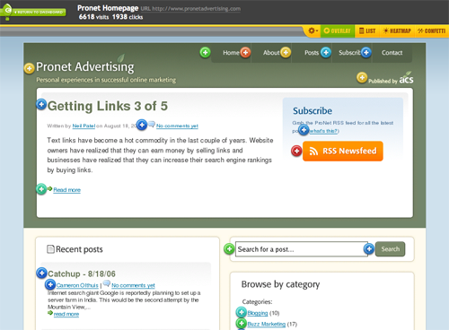
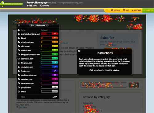
    crazyeggcrazyegg_confetti

    Fantastic application which adheres to every one of the principles. At first, I thought the confetti feature was going to ruin the evaluation, but it is a perfect balance of innovation and usability. Look at how they use common checkboxes for selection, and wiggle the confetti when a source is added- very rich, very nice.

    Interactive demo is available

    02. Mint

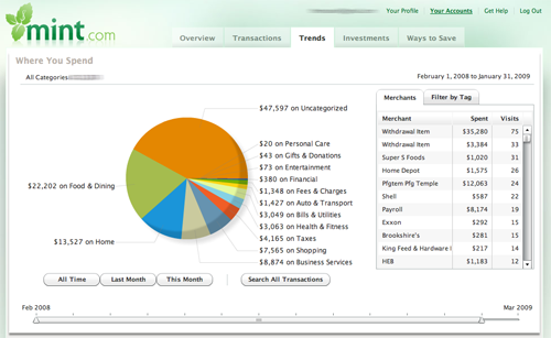
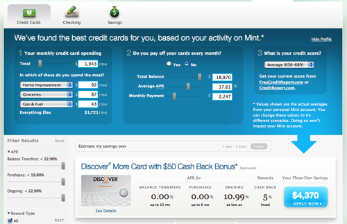
    mintmint_saver

    Mint’s user experience only gets better and better. You may want more features in the product (money market support…), but the features they offer are perfectly executed. Primarily developed with HTML, CSS, JS and Ajax, they chose to incorporate Flex in the Trends section.
    The new Ways to Save section is completely dynamic, updating as you adjust amounts, scores and preferences.

    Free registration is available

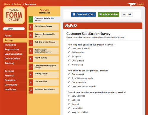
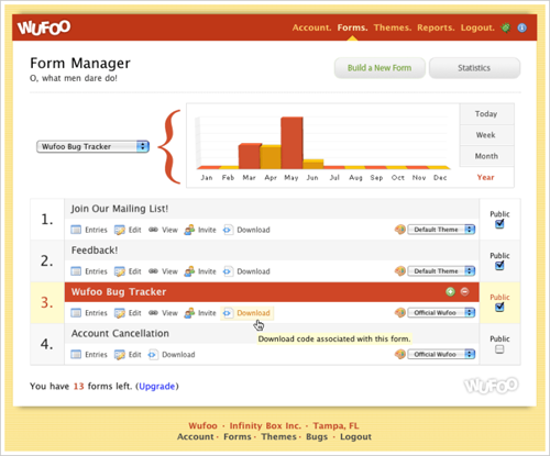
    03. Wufoo

    wufoowufoostatistics

    Wufoo is an extremely well designed tool that has more than meets the eyes. Play with the templates and report creator for inspiration in keeping it simple, and look at they way they use Blank Slate and Help Tips to keep you moving towards your goal. It is almost even fun :o )

    A nice product tour and free plan is available

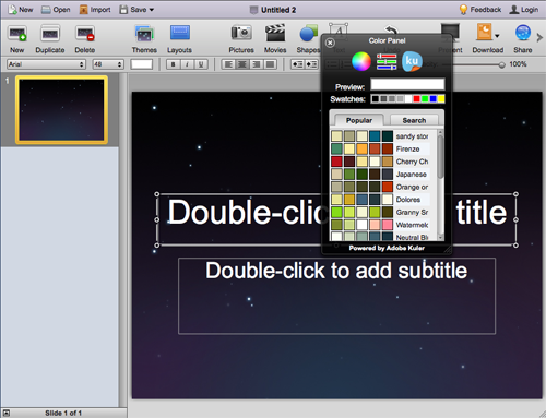
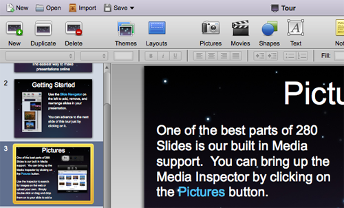
    04. 280 Slides

    280slides280slides_toolbar

    One word- slick. If only all of my projects could be this perfect. Yes, it seems like Keynote (or PowerPoint) on the web, but take a closer look at some of the features. Instead of the maddening Inspector and Format menu, the common formatting functions are in the toolbar. Everything is there when I need it, they even incorporated Adobe Kuler in the color palette!

    Free trial available

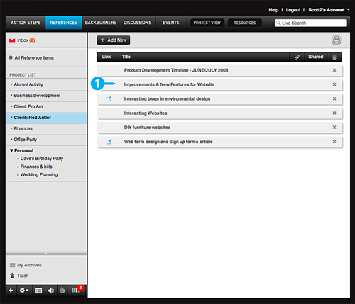
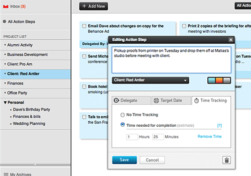
    05. Action Method

    actionmethodactionmethod_dialog

    Another very well implemented product. It is easy to get started with the Blank Slate screens providing tips and directions, and even easier to get comfortable using the product because it uses a standard screen patterns and common controls.
    Every detail has been accounted for. Notice the visual design that makes it clear that the tasks can be dragged around and reordered.

    Trial version available

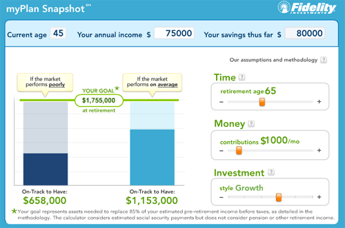
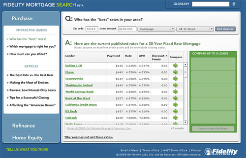
    06. Fidelity Labs

    fidelitymyplanfidelitylabs_mortage

    In 2006 Fidelity Labs started cranking out some very nice RIAs, one of them being Fidelity MyPlan. The Mortgage Search and Homes Sold were also very nice, but have been retired. Unfortunately, their newest 3D Portfolio Analyzer, is not up to par with their earlier beta products.
    The direct interactions and what-if scenarios in MyPlan seem to have inspired Discovers Paydown Planner and other direct manipulation financial planning tools.

    Fidelity MyPlan is publicly available

    07. Pandora

    pandorapandora_tip

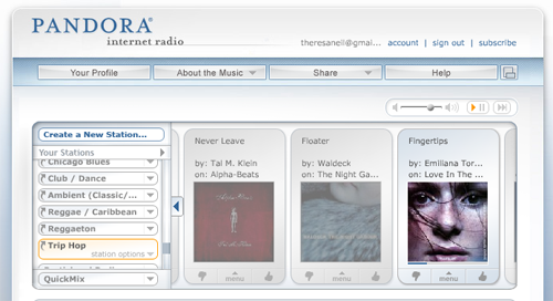
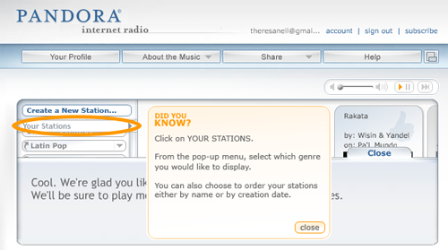
    Pandora has been around since 2005 and has finally gained popularity. It has a very simple, intuitive interface, which makes it easy to get started. The menu offers direct interaction for rating the song ‘up’ or ‘down’, while also providing advanced options such as “don’t play this song again for a month”. And the help tips, shown at just the right time in the workflow, provide a glimpse into advanced features.

    Pandora is publicly available

    08. Wave Maker

    wavemakerwavemaker_model

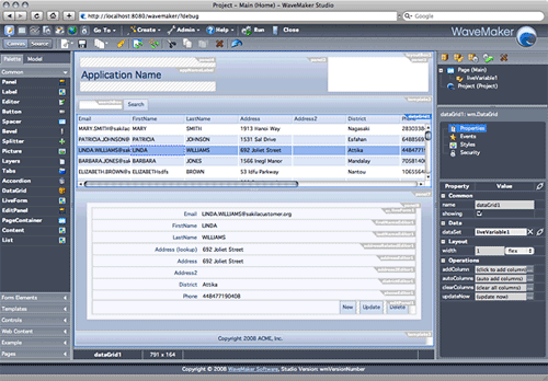
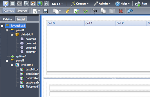
    Wavemaker is a great example of how a complicated product with many features can be clarified with good interface design. They use a logical page flow from left to right- matching the developer workflow of adding a control to the canvas (LEFT) , physically manipulating it (CENTER), then entering tweaking the details in the properties and style panel (RIGHT).

    A Cloud Edition is available

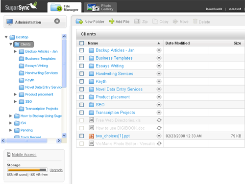
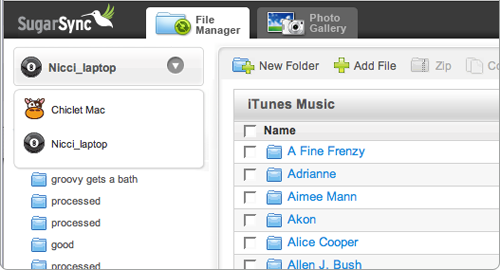
    09. SugarSync

    sugarsync_grid
    sugarsync

    Another great product that relies upon standard screen patterns and common controls to create an intuitive efficient experience. Awarded Top 10 User Interfaces of 2008 by Jakob Nielsen. Report available for purchase.

    A 45 day trial is available

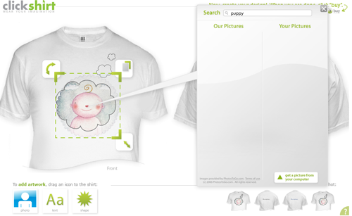
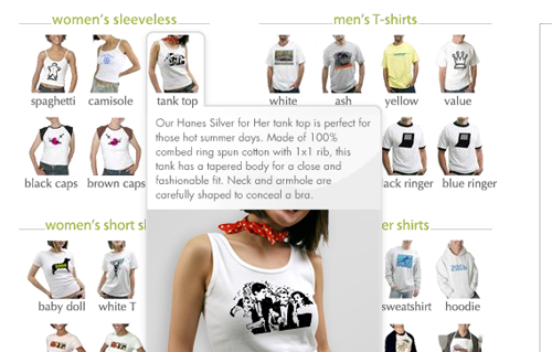
    10. clickshirt

    clickshirtclick_hoverclick_click

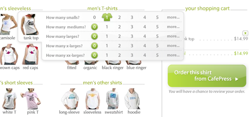
    clickshirt keeps it simple and fun with integrated demos and lively interactions. Event the checkout is rich, hover to see more details about the t-shirt type, click to specify the size and quantity. No gratuitous paging in this application.

    clickshirt is publicly available

    More Good RIAs

    These products have good examples of rich usable components, although they may not have met the 10 basic principles for usability throughout the whole application.

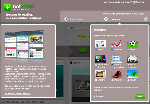
    NetVibes

    netvibes1

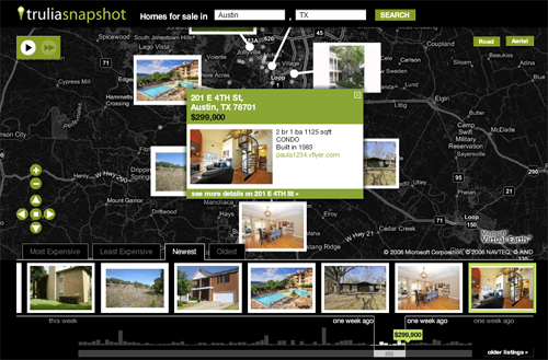
    Trulia Snapshot

    truiasnapshot1

    37signals products like Highrise

    highrise

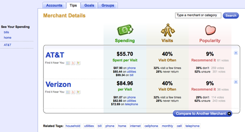
    Wesabe

    wesabe

    Keep an Eye on These

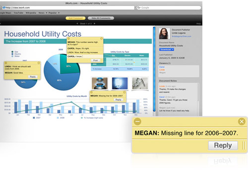
    iWork.com Publishing Tool

    iworkcom-comments

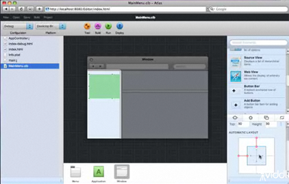
    Atlas

    atlas

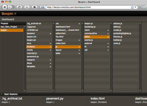
    Bespin

    bespin

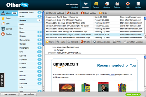
    OtherInbox

    otherinbox

    Comment with your favorite RIA

    I realize I have only skimmed the surface here, please comment with a link to the best RIA you use.

    Thanks to Rob Jones and Greg Leppert for helping me pull together this list.

    Comments (9)

    6 Tips for a Great Flex UX: Part 2

    By Theresa Neil

    Since the book focuses on rich interactions, I want to spend some time on Adobe Flex/AIR.

    These tips are based on the best Flex resources I have found, and how you can use them to craft a great user experience. This is part 2 of 6:

    • Play With It: 10 Explorers & Galleries
    • Learn From the Best: 10 Great Flex Apps
    • Learn From the Rest: 10 Great RIAs
    • Stock Your Toolbox: The Essential Controls
    • Review Best Practices for Designing a RIA
    • Avoid Common Mistakes: 10 Anti-Patterns

    Learn from the Best: 10 Great Flex Apps

    Take a look at some of the best Flex applications on the market. How did I decide these are the best? I reviewed numerous applications, basing the evaluations on Jakob Nielsen’s 10 Principles for User Interface Design:

    Feedback — Metaphor — Navigation — Consistency — Prevention — Recognition — Efficiency — Design — Recovery — Help

    I realize these guidelines are a bit old (from 1990!)- but all applications should meet these guidelines at a minimum. The applications listed below also embody our 6 Principles for Rich Interaction:

    Make it Direct — Keep it Lightweight — Stay on the Page — Provide an Invitation — Use Transitions — React Immediately

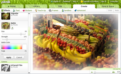
    01. Picnik

    picnik
    Free version available

    02. Balsamiq

    balsamiq
    Trial version available

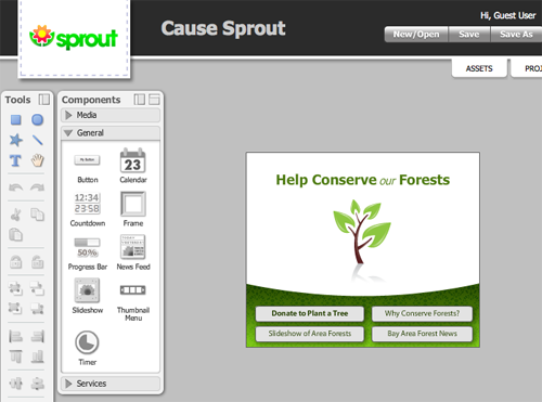
    03. Sprout Builder

    sproutbuilder
    Demo version available.

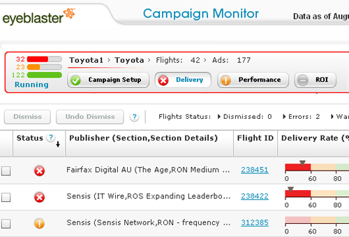
    04. Campaign Monitor by eyeblaster

    campaignmonitor
    Commercial application- no demo available. Awarded Top 10 User Interfaces of 2008 by Jakob Nielsen. Report available for purchase.

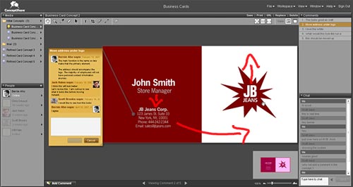
    05. ConceptShare

    conceptshare
    Free account available.

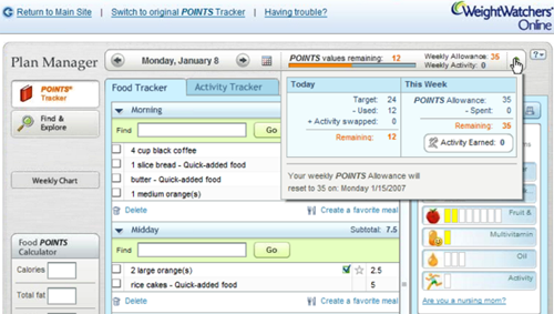
    06. Weight Watchers eTools

    weight_watchers
    Commercial application- no demo available.

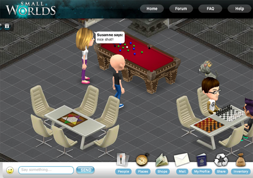
    07. Small Worlds

    smallworlds
    Free account available

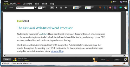
    08. Buzzword

    adobebuzzword
    Free account available

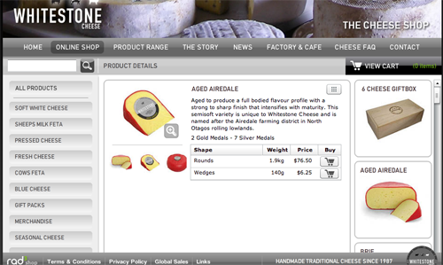
    09. Whitestone Cheese

    whitestone
    Publicly available at www.whitestonecheese.co.nz

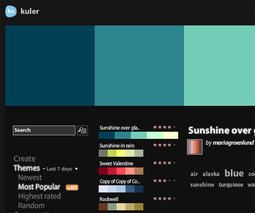
    10. Kuler

    kuler
    Publicly available at kuler.adobe.com

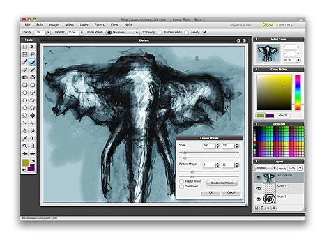
    11. SumoPaint

    sumopaint-screen
    Free account available

    Close Contenders

    These apps were really close, but missed a couple of key principles, or are still maturing.

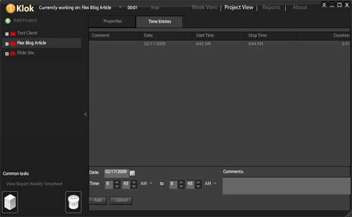
    Klok

    klok_fullscreenklok_time_entries
    Free personal download available

    Nice time tracking product in AIR- nailed the metaphor, but haven’t Made it Direct enough (yet). I instinctively want to click in my calendar to start logging my time against a certain project. Instead I have to navigate to Project View, then into Time Entries. And spinners for entering start and stop times are inefficient.

    I must say I love the Weekly Time Sheet though, and the fact I can drag it to my desktop! I think this product will mature very nicely.

    Tour Tracker

    tour_tracker_fullscreen
    tourtracker_allcaps
    Up for a limited time at Amgen Tour of California.

    Looks amazing. The metaphor is perfect- big map showing the course and stages- but lost points on some basic principles. Specifically Feedback- I click and click to “watch a rider” on the home page, nothing happens, so I keep clicking. And Design- a black background might demo well, but white and blue tex, all caps, sure is hard on the eyes.

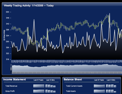
    Google Finance Dashboard

    googlefinance
    Publicly available at BrightPoint Consulting

    This is a really nice dashboard showing what can be done with Flex & Degrafa. I can’t wait to see how they finish it out. Also check out Tom Gonzale’s blog for more amazing data visualizations with Flex and Degrafa.

    htmlText Editor 2008

    htmltexteditor1
    Publicly available at www.theflexguy.com

    This is a neat little one screen application that absolutely Stays in the Page and Makes it Direct. However, the Filter Tags feature is non-standard in more than one way: “If you remove tags and see that they really were needed, you can just uncheck the box and press Filter tags again.” I know the space is limited but Undo and Redo buttons would make more sense.

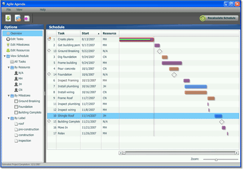
    Agile Agenda

    agileagendaagile_agenda_clicks
    Free trial download available

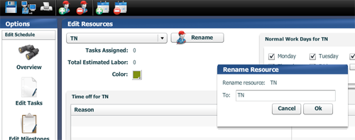
    Project management tool in AIR. Missed the Keep it Direct, and Stay in the Page principles. Too many dialogs where simple inline editing would have sufficed. Need better icons, or text with the icons. Usability aside, the product’s functionality seems to be quite robust and well worth the price.

    Comment with your favorite Flex applications

    I realize I have only skimmed the surface here, please comment with a link to the best Flex UIs you know of.

    Comments (14)

    15 Common Component Patterns

    By Theresa Neil

    As Bill mentioned in an earlier post, we don’t want to limit this blog to just the principles and patterns found in the book. For that you can check out our Explore the Book section.

    This is the third article in a three part series on patterns and principles for RIA design.

        Standard Screen Patterns: 12 patterns w/100 examples
        Essential Controls: 30 controls for RIA design and development
        Common Component Patterns: 15 patterns and examples

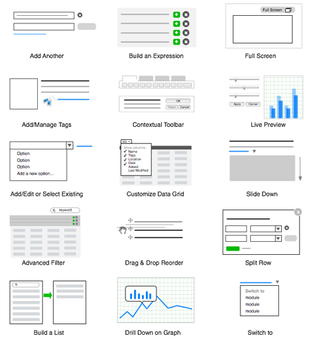
    Odds are good if you are designing a enterprise software or a productivity web application, you’ll need a number of these components. Don’t spend time and effort on (re)designing these ancillary features- try these solutions instead.
    15_common_components2

    01. Add Another

    component_add_another_wufoo1
    Wufoo (button)

    component_add_another_gmail1
    Gmail (link)

    Requirement: Need to offer multiple input fields for the same thing, but unsure how many the user may need
    Example: Add attachments, enter phone numbers, upload photos…
    Description: The “add another” link or button should be in proximity to the field, and the remove option is shown an attachment is added, and only one “add another” link is shown at a time. No need to show the remove button until at least one entry is shown.

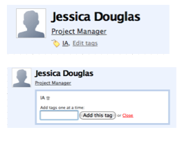
    02. Add/Manage Tags
    component_add_tags_highrise
    Highrise (inline edit)

    component_add_tags_mint
    Mint (dialog)

    Requirement: Need a way to add non-structured meta data to an object that can later be searched
    Example: While adding recruits to a CRM system, the recruiter wants to note applicants’ interests and hobbies
    Description: Place the tags in close proximity to the object being taggged. Allow for direct adding of additional tags and editing. You can take the 37signals approach and let users type in any tags they want- running the risk of duplicate, misspelled or overlapping concept tags. Or use Mint’s approach and let users select from the existing list of tags, and/or add new ones.

    03. Add/Edit or Select from Existing
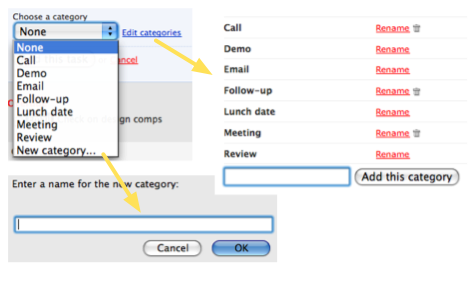
    componenet_add_edit_select
    Highrise

    Requirement: Need to pick from an existing option, add a new option, or edit an existing option
    Example: Recording receipts for household expenses, and there is not a category for pet/vet bills. Add a new category for “pets”, which will now show up as an option in the list
    Description: Place the option for “add new…” at the bottom of the options. Open a new dialog or light weight layer to add the new option. Place edit to the right of the list box, edit can be a new screen or dialog for editing all the options.

    04. Advanced Filter

    component_advanced_search1
    Mission 360 for The Leukemia & Lymphoma Society

    Requirement: Need to refine the data set based on specified criteria
    Example: In a bug tracking system, a developer needs to see all bugs assigned to him, in the last 24 hours, related to the production system, containing the term “feedback”
    Description: Provide a dynamic filter field and offer an advanced filter option, where the user can specify criteria for refining the data set. Allow the criteria to be saved (usually as a ‘view’), that can be accessed again. Note* Luke W. has a great article describing multiple techniques for refining data tables.

    05. Build a List (aka Accumulator)
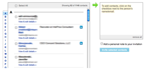
    component_build_a_list_linkedin
    LinkedIn

    Requirement:Need to create a list from an existing set of options
    Example: Invite some of your friends from your existing list of webmail contacts, or build a list of hot prospects for a sales campaign
    Description: When a user needs to select items from separate sets of search results or other large, unwieldy data sets- let them manipulate the left (search, sort, navigate or filter), and add to the right.

    06. Build an Expression (aka Predicate Editor)
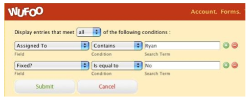
    component_build_expression
    Wufoo

    build_expression
    Mac OS predicate editor inspired web versions of this component

    Requirement: Need to define a set of conditions that build on each other.
    Example: Complex search or building a report filter, or building a mathematical function
    Description: Design it so the expression can be read, left to right, top to bottom. Each line can be edited, removed, or deleted, and possibly rearranged in order.

    07. Contextual Toolbar

    component_group_tools_picnik
    Picnik

    Requirement: Need to perform an action that has multiple input parameters
    Example: Analyst needs to apply a discount to all the rows in a table, clicks the ‘discount’ tool. The discount options: discount percent [10%] or flat rate discount [$0.00], are then provided.
    Description: Group the actions in a toolbar, and as one is selected, disclose the input parameters. Offer a live preview if applicable.

    08. Customizable Data Grid
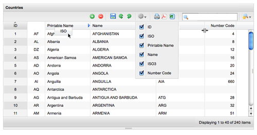
    component_configure_datagri
    Flexigrid demo

    Requirement: Need robust data grid from viewing, editing and manipulating data
    Example: A CRM system with contacts displayed in a table/data grid
    Description: Offer simple and advanced filtering, ability to directly resize columns, ability to directly rearrange columns, hide/show columns, sorting. If also providing editing, provide a toolbar that includes undo and redo actions.

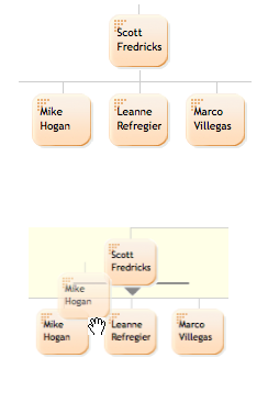
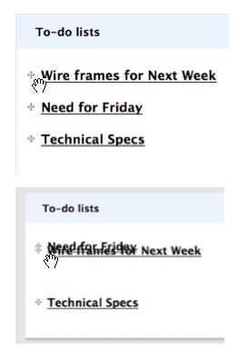
    09. Drag & Drop Reorder
    component_drag_drop_list
    Basecamp

    component_drag_drop_reorder_cogmap
    Cogmap

    Requirement: Need to reorder a text list, visual map, or tree because the order is indicative of priority or hierarchical relationship
    Example: To-do list, org chart, tree
    Description: Make sure to follow the interaction principles for all the states of drag and drop management, most importantly providing a visual cue the list can be rearranged, like the drag handles in the examples. Refer to Bill’s Interesting Moments Grid for implementing the interaction properly.

    10. Full Screen

    component_fullscreen_picnik
    Picnik

    component_fullscreen_radedi1
    RadEditor Demo

    Requirement: Need more real estate for core functionality
    Example:Editing a photo, designing a work flow, navigating a map
    Description: Place the toggle in the top left corner (make sure it remains in the same spot and visible even in the full screen mode). The branding and top level navigation can be hidden in this mode. Don’t add any more elements into the full screen mode- just enlarge the workspace.

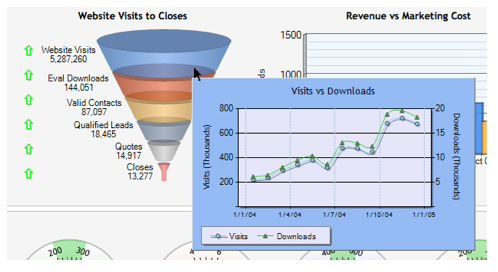
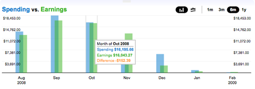
    11. Graph Drill Down
    component_graph_hover_wesabe
    Wesabe

    component_graph_hover_dundas
    Dundas Charts

    Requirement: Need to show a summary view and allow a quick and efficient drill down to view more details, instead of navigating deeper into the graph
    Example: A specific datapoint has multiple sets of information available. The main graph could show sales volume by sales person over time, and the hover detail breaks it down by new versus existing clients
    Description: Provide a visual indicator (like a dot) that hover details are available. Use a non-modal layer to display the next level of data.

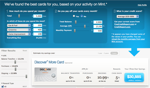
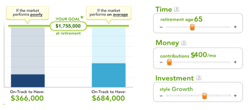
    12. Live Preview
    component_live_preview_fidelity
    Fidelity MyPlan

    component_live_preview_mint1
    Mint Savings Finder

    Requirement: Need provide live feedback on changing criteria
    Example: Graphic designer altering the hue of a photo needs to see the effect as he adjust the value
    Description: Provide easy to manipulate controls, and an “apply” and “cancel” options, or “revert” feature.

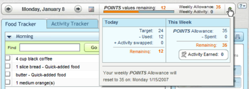
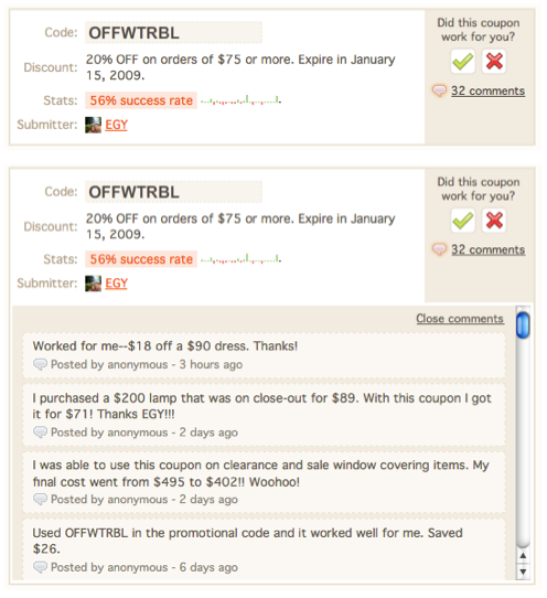
    13. Slide Down
    component_slide_down_retail
    RetailMeNot.com (inline)

    component_slide_down_weightwatchers
    Weight Watchers (overlay)

    Requirement: Need to show more details, or input details
    Example: Reading an article in a list of articles, scan the first paragraph and want to read more, or read the comments.
    Description: Expand inline or overlay without leaving the page or opening a new window/dialog. Use smooth transitions and a fixed height scroll window like RetailMeNot. Provide the close link in the same spot.

    14. Split a Transaction
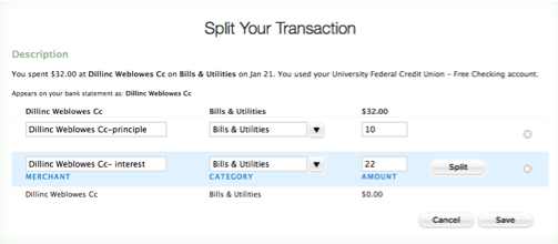
    component_split_transaction
    Mint

    Requirement: Need to allocate a single item across multiple categroies
    Example: Dividing a transaction (ex. allocating a 50% of a donation to one recipient, and 50% to another recipient, or $2.00 as a fee, and $200.00 as cash withdraw)
    Description: Split button placed unobtrusively in the transaction detail pane, could also be a tool in the table toolbar, enabled when a row is selected. Opens a dialog allowing the user to re-allocate the data as needed.

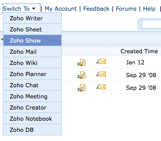
    15. Switch To
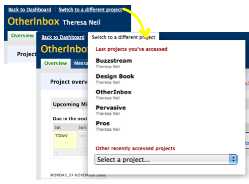
    switch_to1
    Basecamp

    switch_to_zoho
    Zoho

    Requirement: Need to infrequently navigate out of one module into another without returning to a control panel, dashboard or dock
    Example: Working in one project, finish and need to work on another one
    Description: Make the switch less visually prominent than the main navigation, but still easily accessible (top right or left, above the main menu).

    Comments (23)
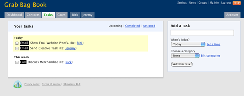
    Screencasts Added to Flickr

    I just uploaded around 390 screencasts to the Flickr Designing Web Interfaces photostream. These are movie captures of various sites illustrating patterns from each chapter. This makes a nice supplement to the hundreds of figures that are already on the site.

    The screencasts are in the DWI: Screencasts collection and organized into Sets that represent each chapter of the book. For example if you are looking for examples for Chapter 13, Lookup Patterns then the Set Chapter 13 (SC) – Lookup Patterns contains 70 screencasts illustrating various lookup patterns.

    Comments (8)