Examples for Functionality, Gamification, and Feedback Loops

I noticed an article on bokardo, Joshua Porter’s blog, about Functionality, Gamification, and Feedback Loops. He has some insightful comments on the Wired magazine article Harnessing the Power of Feedback Loops.

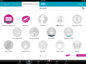
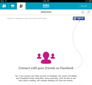
I saw a great example of gamification and feedback loops in the iPad app Kobo. Kobo is an alternative to iBook. Unlike iBook, Kobo has integrated a concept called “Reading Life” that offers awards, statistics, and images to share in my social networks

Kobo tablet screenshots- from OhGizmo

I immediately called my friend and asked her to get Kobo on her iPad so we could both use it and see who reads the fastest (a little competitive spirit going on). Then I sent a link to another friend- encouraging her to use it too. Then I bought some books and will shortly post my Bookcover on Facebook.

Compare this to Audible’s Stats (timer, achievement awards and badges), which leave me feeling under-motivated. I mean, I’ll use the app and all, but I’ll never intentionally open the Stats screens again.

Kobo and Audible are both using gamification techniques to encourage specific behaviors (buy more books). So why is Kobo getting me to change my behavior and Audible isn’t?

  1. Audible has a bug and isn’t pulling in any of my hundred of stories I’ve bought over the past few years. So the feedback loop that might encourage me to “level up” isn’t working because the data is bad (I’m not an AppNewbie).
  2. Kobo started me off with some badges already earned (good for me!), Audible has me at 0 out of 15 (lame-o).
  3. The stats in both apps stay up to date to reflect my reading/listening patterns. Audbile only has one stat, listening time, whereas Kobo offers lots of interesting information.
  4. Most importantly: Kobo tapped into not only how I read (pages per hour), but how reading is a part of my life. I’m in a book club, I share my favorite titles and authors with friends, I read out loud to my kids, my mom and I bond over books. With Kobo’s “Reading Life” I can now easily share what I’m reading with my circle of friends and family.

Please share other example of apps using gamification and feedback loops effectively, or examples of ones that failed.

Comments (4)

The Multi Select Solution

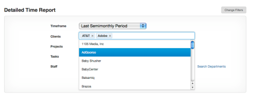
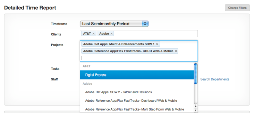
Harvest, the time tracking and invoicing tool we use, just added a new filter mechanism to their report generator. While I appreciate the additional functionality, I was most impressed with their multi-select combobox. It looks like a normal text field, but once the field has focus you can select any option and it will be added into the field, click again and you can select another option, building up any number of options. The field just gets larger (more rows are added) when you add more options than can be displayed in a single row.

It is equally easy to remove items from the field by clicking the little ‘x’ next to each option.

Does anyone know if there is a JQuery control for this? That would be awesome. A Flex control like this would be nice too, just in case there are any motivated developers reading this (wink, wink)…

Comments (2)

Gmail uses The Drag & Drop Object Pattern to “Make It Direct”

Principle #1: Make it Direct

In the earlier version of Gmail, the only way to label or organize messages was to select the row or rows, then navigate to the “Move To” combo box or “Label” combo box.

But last week (at least in my Gmail account) Google decided to Make It Direct. Why select a row and look for an action button somewhere- just grab that message and drag it!

The Drag and Drop Object Pattern, in Chapter 2 of our book explains the nuances involved in this pattern such as affordance- ie. letting the user know they can drag something to reorganize the relationship, and clearly indicating the available drop zone.

Affordance

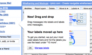
Gmail introduces the feature with a well designed help tip:
google-tip1

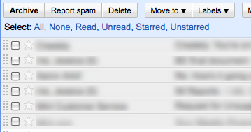
And by visually indicating the messages can be moved by displaying a drag handle on each row:
gmail_drag-handle

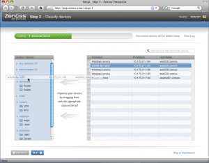
We did something similar in the new design of Zenoss, an open source systems management application. On Step 3 of Set-Up, the systems administrator can efficiently organize their infrastructure by dragging devices (right) into the proper category (shown on left).

drag_drop_reorg_zenoss

Since this is a set-up screen folks will only use once, we decided to embed the instructions in the screens instead of using a dialog with the tip.

Drop Zone

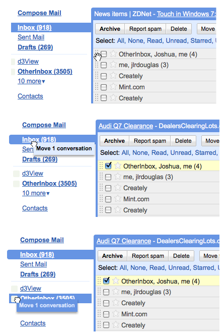
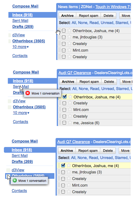
Although Gmail did a nice job introducing the feature, they didn’t implement the standard cursors for drop zones:
drag_drop_gmail1

Typically, the cursor should provide feedback when hovering over different zones, showing the user where the object can or can’t be dropped:
drag_drop_revise

The Ajax framework Ext JS handles this perfectly right out of the box- click to watch the screencast.

Expandable Drop Zone

So does this mean I have to go click to expand to see ‘12 More’ before I can drag any messages into those folders? Nope- Gmail borrowed an slick interaction from the Mac – the Expandable Drop Zone.

Now in Gmail, you can select one or more messages, drag them to an expandable drop zone, and a layer opens dispalying all of the other labels. Bill mentioned to me that a slightly longer delay ‘on drop’ would help provide feedback that the messages actually ended up in the right label.

Comments (3)