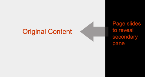
Page Slide: Stay on the Page Pattern
What happens when you don’t have the on-screen real-estate to display a set of controls? In our book we discuss a number of real-estate extending techniques in the section on Stay on the Page. While discussing Zoomable User Interfaces (Chapter 7) we looked at Aza Raskin & Scott Robin’s Firefox Concept Prototype. We made passing reference to a Slide Over as a way to bring in more content.

I recently spotted a clearer example (from Scott Robbins) of this pattern from an article on Ajaxian. In that article it is called the Page Slide pattern. I like this better than Slide Over, as Page Slide is a more descriptive name for this idiom. This is an excellent article and the pattern provides a nice technique for extending real-estate on the screen.
This pattern really shines in gesture based interfaces, but can be used in mouse-based interfaces as well. One challenge is providing a discoverable mechanism for sliding back and forth. Depending on the design constraints it could be solved by some very explicit call to action links or buttons for activation/de-activation.
Usage
- To reveal additional navigation controls
- In TV or mobile space since controls and/or space is limited
- To expose a configuration panel (similar to the Module Configure Pattern)
- To a lesser extent to reveal help or contextual information (the partial hiding of the related content might make it a poor choice for this)
Challenges
- Discoverability
- Losing context with the rest of the page
- Make the disruption work for you
Recommendations
- Use it sparingly only for major context switches
- Make the animation fast. No reason to wow the user with your ability to scroll
- Make the activation/deactivation dead simple
Other usages, challenges, recommendations? What do like/dislike about this pattern? Are you planning to use this in a future project?

43 Essential Controls for Web Applications | UX Booth Said,
March 9, 2010 @ 7:44 am
[...] Panels Inlay panel on the BBCLots of controls fall in this category including: page slides, inlay and overlay panels, accordions, and collapsible panels that allow for more than one section [...]
43 kljuÄne kontrole za web aplikacije | Adriatek Said,
June 22, 2010 @ 1:42 am
[...] Padajući paneli Flickr Video Dosta kontrola spada u ovu kategoriju, a tu možemo ukljuÄiti: page slajder, unutraÅ¡nje, spoljaÅ¡nje i padajuće panele koji dozvoljavaju da se otvori i viÅ¡e sekcija [...]