Page Slide: Other Examples and Variations

After posting about the Page Slide pattern, I realized there were a few other good examples from the book as well as an another example from Laszlo’s Demo Calendar App that Theresa pointed me to.

Dialog Inlay Variation

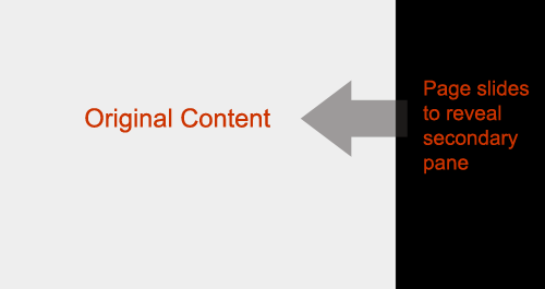
Both the BBC and My Yahoo! use a variation of the Page Slide to bring in customization controls for their home pages. In our book we call this out as a Dialog Inlay. In contrast to providing an Overlay (popup) content can be slid into the context of the page. Note in both of these examples the sliding is vertical from the top of the page (although note the banner stays in place).

dwi_0601b (by Designing Web Interfaces)

The BBC Home Page uses a PageSlide to let you configure content settings

dwi_0603 (by Designing Web Interfaces)

My Yahoo! also uses a PageSlide to let you add content or change appearance

Slide by Squashing

Laszlo provides an interesting variation to the Page Slide. Instead of sliding the calendar off page to accomodate the new area, it resizes the calendar so that there is room for the additional controls. This deals with the earlier problem we raised of losing context. With a calendar we need to see the whole month, but it is most likely acceptable to resize the calendar to accomodate.

slidein_laszlo_normal (by Designing Web Interfaces) slidein_laszlo_expand (by Designing Web Interfaces)

Laszlo resizes the calendar area in real-time as it slides in the controls from the right

Comments off

Page Slide: Stay on the Page Pattern

What happens when you don’t have the on-screen real-estate to display a set of controls? In our book we discuss a number of real-estate extending techniques in the section on Stay on the Page. While discussing Zoomable User Interfaces (Chapter 7) we looked at Aza Raskin & Scott Robin’s Firefox Concept Prototype. We made passing reference to a Slide Over as a way to bring in more content.

Page Slide Example

I recently spotted a clearer example (from Scott Robbins) of this pattern from an article on Ajaxian. In that article it is called the Page Slide pattern. I like this better than Slide Over, as Page Slide is a more descriptive name for this idiom. This is an excellent article and the pattern provides a nice technique for extending real-estate on the screen.

This pattern really shines in gesture based interfaces, but can be used in mouse-based interfaces as well. One challenge is providing a discoverable mechanism for sliding back and forth. Depending on the design constraints it could be solved by some very explicit call to action links or buttons for activation/de-activation.

Usage

  • To reveal additional navigation controls
  • In TV or mobile space since controls and/or space is limited
  • To expose a configuration panel (similar to the Module Configure Pattern)
  • To a lesser extent to reveal help or contextual information (the partial hiding of the related content might make it a poor choice for this)

Challenges

  • Discoverability
  • Losing context with the rest of the page
  • Make the disruption work for you

Recommendations

  • Use it sparingly only for major context switches
  • Make the animation fast. No reason to wow the user with your ability to scroll
  • Make the activation/deactivation dead simple

Other usages, challenges, recommendations? What do like/dislike about this pattern? Are you planning to use this in a future project?

Comments (2)