Does It Have Legs- Heuristics for Information Architecture
Great talk from Abby the IA. Fresh style, clearly expressed. Can’t wait for the poster she’s making.
Information Architecture Heuristics
View more presentations from Abby Covert
Great talk from Abby the IA. Fresh style, clearly expressed. Can’t wait for the poster she’s making.
I noticed an article on bokardo, Joshua Porter’s blog, about Functionality, Gamification, and Feedback Loops. He has some insightful comments on the Wired magazine article Harnessing the Power of Feedback Loops.
I saw a great example of gamification and feedback loops in the iPad app Kobo. Kobo is an alternative to iBook. Unlike iBook, Kobo has integrated a concept called “Reading Life” that offers awards, statistics, and images to share in my social networks 
Kobo tablet screenshots- from OhGizmo
I immediately called my friend and asked her to get Kobo on her iPad so we could both use it and see who reads the fastest (a little competitive spirit going on). Then I sent a link to another friend- encouraging her to use it too. Then I bought some books and will shortly post my Bookcover on Facebook.
Compare this to Audible’s Stats (timer, achievement awards and badges), which leave me feeling under-motivated. I mean, I’ll use the app and all, but I’ll never intentionally open the Stats screens again.

Kobo and Audible are both using gamification techniques to encourage specific behaviors (buy more books). So why is Kobo getting me to change my behavior and Audible isn’t?


Please share other example of apps using gamification and feedback loops effectively, or examples of ones that failed.
Last year we posted an article on 12 Standard Screen Patterns. It has been incredibly popular so we updated it for 2010. The full article will be published at UX Magazine. In the meantime, take a look at the 15 standard layouts and examples from more than 80 current RIAs:
I saw Todd Warfel speak in August at DELVE UI. I was so inspired by his approach that I changed the way we work. We have now moved away from large decks of wireframes and interaction notes- and embraced the 70% rule. We design 70% then build a prototype. There are a number of examples in my talk Designers vs Developers: Coming together to build the best RIAs. But the point is, if you are designing Rich Internet Applications, RIAs, prototyping is essential.
Check out Todd’s talk on prototyping:
And consider getting his new book, Prototyping: A Practitioner’s Guide to Prototyping, Rosenfeld Media, November 2009. It is full of practical advice and detailed examples, not philosophical musings. If you are like me- a busy consultant who is not a great programmer, but needs to get interactive mock-ups in front of stakeholders as fast as possible- there are a number of great ideas in here.
I posted this on my personal blog and according to slideshare it is the top tweeted presentation from their site today (9/20/09). Been meaning to post it here for those who don’t follow my blog. The material contains some new examples but tracks with the book’s six principles.
I recently gave this talk at Microsoft for their UX team, at the Ruby Meetup Group at the CMU campus in the bay area and most recently at the Ajax Experience in Boston. Next time I will be giving this talk is in December at the Rich Web Experience (first week of December) in Orlando, Florida.
Over on my other blog (looksgoodworkswell) I posted two examples of Anti-Patterns that relate to our book.
The first is Geek Speak. Presenting the user with jargon they will not understand (usually when something goes wrong deep in the bowels of the software). This example is from Facebook.
")
The second is an example of Needless Fanfare (which we write about in the book). Unnecessary animation/transitions that instead of reinforcing communication needlessly distract from the job at hand. Turbo Tax weighs in with their version of the Biggest Loser scale when they recalculate your taxes on the fly.
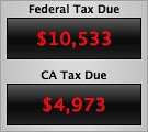 Read the full discussion on Geek Speak and Needless Fanfare over on my blog.
 By Theresa Neil
Since the book focuses on rich interactions, I want to spend some time on Adobe Flex/AIR.
These tips are based on the best Flex resources I have found, and how you can use them to craft a great user experience. This is part 5 of 6:
* Play With It: 10 Explorers & Galleries
* Learn From the Best: 10 Great Flex Apps
* Learn From the Rest: 10 Great RIAs
* Stock Your Toolbox: 40+ Custom Flex Controls
* Review Usability Best Practices
* Avoid Common Mistakes: 10 Anti-Patterns
Don’t forget the usability basics. Jakob Nielsen’s Ten Usability Heuristics are as relevant now as they were in 1999. I stress this because I looked at the Flex showcase recently, and it looks like many of the applications are not built with these best practices in mind.
The system should always keep users informed about what is going on, through appropriate feedback within reasonable time.

1.0 BaseCamp by 37signals
The upload button is enabled, until clicked. Then it is replaced with a progress indicator until the file has finished uploading

1.1 Picnik
Progress message and indicator shows while the application loads

1.2 Tick
A feedback message is displayed when an action is performed

1.3 Windows Live Account
Password strength is shown as the password is entered
The system should speak the users’ language, with words, phrases and concepts familiar to the user, rather than system-oriented terms. Follow real-world conventions, making information appear in a natural and logical order.

2.0 iTunes
Organized as a library that contains your media library: music, movies, shows, audibooks. Beneath the Library is the Store where you can buy more media to put in your Library.

2.1 Mindomo
The branches and hierarchy of a mind map can be easily reorganized visually in a non-linear manner. An outline would never work, but this matches the paradigm exactly.
Users often choose system functions by mistake and will need a clearly marked “emergency exit” to leave the unwanted state without having to go through an extended dialogue. Supports undo and redo and a clear way to navigate.

3.0 CollabFinder
Search is easy to open, enter info, execute or cancel.

3.1 Wufoo
Clearly marks where the person is and where they can go by showing the selection in each menu

3.2 Pages (Apple’s Word Processing Product)
Cell editing shows row and column ids, and the cells used in the equation. The equation can be saved or canceled.

3.3 Balsamiq
Undo and Redo buttons are available in the toolbar, and can also be accessed with the standard keyboard shortcuts
Users should not have to wonder whether different words, situations, or actions mean the same thing. Follow platform conventions.

4.0 Gmail
When Gmail was designed, they based the organizational folders on the same ones used in client email applications: Inbox, Drafts, Sent Mail.

4.1 Microsoft Office
Word, Excel, and PowerPoint all use the same style toolbar with the same primary menu options: Home, Insert, Page Layout… Consistency results in efficiency and perceived intuitiveness.
Even better than good error messages is a careful design, which prevents a problem from occurring in the first place.

5.0 Yammer
Disables the update button after it is clicked, so the person cannot update the post twice by accident

5.1 Example from “Web form Design:Filling in the Blanks” by Luke W.
Make the primary action prominent with a larger click area. Cancel and secondary actions are just shown as links

5.2 Google Auto Recommend
The auto recommend feature cuts down on mis-spellings

5.2 Wikpedia
Auto focus on input prevents a common source of frustration, typing only to realize nothing is displayed because the field did not have focus
Minimize the user’s memory load. Make objects, actions, and options visible. The user should not have to remember information from one part of the dialogue to another. Instructions for use of the system should be visible or easily retrievable whenever appropriate.

6.0 Quanta IDE
Type ahead for coding in a development environment

6.1 Keynote
Previews the fonts you can pick from, instead of just the font name
Accelerators — unseen by the novice user — may often speed up the interaction for the expert user such that the system can cater to both inexperienced and experienced users. Allow users to tailor frequent actions.

7.0 OmniFocus
List of keyboard shortcuts and accelerators

7.1 Numbers- Apple’s Spreadsheet product
Previews common function results on the left when a column is selected, more efficient that clicking on an action in the toolbar
Dialogues should not contain information, which is irrelevant or rarely needed. Every extra unit of information in a dialogue competes with the relevant units of information and diminishes their relative visibility. Visual layout should respect the principles of contrast, repetition, alignment, and proximity.

8.0 Kontain
Kontain’ search menu exemplifies the four principles of visual design:
Contrast: bold text is used for the two labels in the search
Repetition: the orange, blue, and green text match the media types
Alignment : strong left alignment of text, right aligned drop down
Proximity: a light rule is used to separate tags from the other options

8.1 Harvest
Sufficient padding and spacing keep this timesheet from being a visual nightmare. Header and footer rows, as well as the summary column use subtly different colors to indicate they are distinct from the content
Error messages should be expressed in plain language (no codes), precisely indicate the problem, and constructively suggest a solution.

9.0 Digg
Provides immediate feedback with specific instructions

9.1 Humorous ‘ Page Not Found’ Error
Uses a funny image and copy, but provides viable alternatives (article listings and blog link) and a course of action (report it)
Even though it is better if the system can be used without documentation, it may be necessary to provide help and documentation. Any such information should be easy to search, focused on the user’s task, list concrete steps to be carried out, and not be too large.

10.0 Picnik
Contextual help (this is an example of help in the ‘Collages’ module) tips in Picnik are clear and easy to navigate

10.1 GoodBarry
Embedded videos can be used to showcase features as well as get people started using the product

10.2 Zenoss
Help tips are displayed on hover, answering the most likely questions about a field or instructions

10.3 BaseCamp by 37signals
Help opens a new browser window/tab with a full set of help resources: search, FAQ, video tutorials, customer forums
By Theresa Neil
Since the book focuses on rich interactions, I want to spend some time on Adobe Flex/AIR.
These tips are based on the best Flex resources I have found, and how you can use them to craft a great user experience. This is part 4 of 6:
Flex 3 includes a wide range of controls. Unfortunately, it doesn’t have all of the Essential Controls I use for RIA design. But fortunately, talented and industrious Flex developers have created numerous custom controls for Flex.

I pulled together a visual repository of custom Flex controls. Most of these controls were created to showcase certain functionality- not usability best practices. So some may need further refinement to comply with the usability principles discussed in the previous posts. Click on the picture for the demo.

Complex Headers

Horizontal Accordion

Apple Style
More under ‘Collapsible Panels’


ILog Elixir

Ely Greenfield’s early Scheduler

Adobe’s Scheduler on flexlib see flexlib.scheduling package


3D charts by iLog Elixir

Chart Drill Down with Animation

Dashed Line Series

Chart Offest

Advanced Legend

Scroll and Zoom

Window Shade- panels roll up and down

Arc90’s Collapsible Panel

Early Stacked Panels

Doug McCune’s updated Cover Flow


Kap IT Lab
ILog Elixir
BirdEye


In flexlib as Highlighter


ILOG Elixir Gantt

Doug McCune’s Early Gantt Chart

Early example by Ely Greenfield

Modal editing variation by Ryan Swanson
* The hover invitation to edit on a field by field basis (like Flickr) works best for infrequent edits

On flexlib under Icon Loader

On flexlib under Convertible Tree List

On flexlib under flexlib.mdi


Peek Panel by Bill White (nice blog)
Ely Greenfield’s early FlexBook
Didier Braun’s PageFlip

Satish’s Pivot Table

Flex Monster product

Resizeable and moveable window

Resize Objects with ResizeManagerFX

In flexlib as Drag Scrolling Canvas

Degrafa ToggleButtonBar vertical tabs


Vertical Tab Navigator


Early example
Slide out menu with effects instead of states

More examples:
Fusion Charts
Sherlock Informatics
Birdeye
19nates

There is also a Spell Check component on Flex Exchange


At flexlib under prompting TextInput

Early Tree Grid

Alternate one on Flex Exchange as Time Chooser


Open branches by clicking on the row
Adding leaf notes
Showing XML
Rearranging nodes with drag and drop
Drag from a Grid to a Tree


Please comment with a link to your favorite custom Flex controls.
By Theresa Neil
Since the book focuses on rich interactions, I want to spend some time on Adobe Flex/AIR.
These tips are based on the best Flex resources I have found, and how you can use them to craft a great user experience. This is part 3 of 6:
Take a look at some of the best RIAs on the web. How did I decide these are the best? I reviewed numerous applications, basing the evaluations on Jakob Nielsen’s 10 Principles for User Interface Design:
Feedback — Metaphor — Navigation — Consistency — Prevention — Recognition — Efficiency — Design — Recovery — Help
I realize these guidelines are a bit old (from 1990!)- but all applications should meet these guidelines at a minimum. The applications listed below also embody our 6 Principles for Rich Interaction:
Make it Direct — Keep it Lightweight — Stay on the Page — Provide an Invitation — Use Transitions — React Immediately


Fantastic application which adheres to every one of the principles. At first, I thought the confetti feature was going to ruin the evaluation, but it is a perfect balance of innovation and usability. Look at how they use common checkboxes for selection, and wiggle the confetti when a source is added- very rich, very nice.
Interactive demo is available


Mint’s user experience only gets better and better. You may want more features in the product (money market support…), but the features they offer are perfectly executed. Primarily developed with HTML, CSS, JS and Ajax, they chose to incorporate Flex in the Trends section.
The new Ways to Save section is completely dynamic, updating as you adjust amounts, scores and preferences.
Free registration is available


Wufoo is an extremely well designed tool that has more than meets the eyes. Play with the templates and report creator for inspiration in keeping it simple, and look at they way they use Blank Slate and Help Tips to keep you moving towards your goal. It is almost even fun ![]() )
)
A nice product tour and free plan is available


One word- slick. If only all of my projects could be this perfect. Yes, it seems like Keynote (or PowerPoint) on the web, but take a closer look at some of the features. Instead of the maddening Inspector and Format menu, the common formatting functions are in the toolbar. Everything is there when I need it, they even incorporated Adobe Kuler in the color palette!
Free trial available


Another very well implemented product. It is easy to get started with the Blank Slate screens providing tips and directions, and even easier to get comfortable using the product because it uses a standard screen patterns and common controls.
Every detail has been accounted for. Notice the visual design that makes it clear that the tasks can be dragged around and reordered.
Trial version available


In 2006 Fidelity Labs started cranking out some very nice RIAs, one of them being Fidelity MyPlan. The Mortgage Search and Homes Sold were also very nice, but have been retired. Unfortunately, their newest 3D Portfolio Analyzer, is not up to par with their earlier beta products.
The direct interactions and what-if scenarios in MyPlan seem to have inspired Discovers Paydown Planner and other direct manipulation financial planning tools.
Fidelity MyPlan is publicly available


Pandora has been around since 2005 and has finally gained popularity. It has a very simple, intuitive interface, which makes it easy to get started. The menu offers direct interaction for rating the song ‘up’ or ‘down’, while also providing advanced options such as “don’t play this song again for a month”. And the help tips, shown at just the right time in the workflow, provide a glimpse into advanced features.
Pandora is publicly available


Wavemaker is a great example of how a complicated product with many features can be clarified with good interface design. They use a logical page flow from left to right- matching the developer workflow of adding a control to the canvas (LEFT) , physically manipulating it (CENTER), then entering tweaking the details in the properties and style panel (RIGHT).
A Cloud Edition is available


Another great product that relies upon standard screen patterns and common controls to create an intuitive efficient experience. Awarded Top 10 User Interfaces of 2008 by Jakob Nielsen. Report available for purchase.
A 45 day trial is available


clickshirt keeps it simple and fun with integrated demos and lively interactions. Event the checkout is rich, hover to see more details about the t-shirt type, click to specify the size and quantity. No gratuitous paging in this application.
clickshirt is publicly available
These products have good examples of rich usable components, although they may not have met the 10 basic principles for usability throughout the whole application.


37signals products like Highrise


iWork.com Publishing Tool


I realize I have only skimmed the surface here, please comment with a link to the best RIA you use.
Thanks to Rob Jones and Greg Leppert for helping me pull together this list.
By Theresa Neil
Since the book focuses on rich interactions, I want to spend some time on Adobe Flex/AIR.
These tips are based on the best Flex resources I have found, and how you can use them to craft a great user experience. This is part 2 of 6:
Take a look at some of the best Flex applications on the market. How did I decide these are the best? I reviewed numerous applications, basing the evaluations on Jakob Nielsen’s 10 Principles for User Interface Design:
Feedback — Metaphor — Navigation — Consistency — Prevention — Recognition — Efficiency — Design — Recovery — Help
I realize these guidelines are a bit old (from 1990!)- but all applications should meet these guidelines at a minimum. The applications listed below also embody our 6 Principles for Rich Interaction:
Make it Direct — Keep it Lightweight — Stay on the Page — Provide an Invitation — Use Transitions — React Immediately

Free version available

Trial version available

Demo version available.

Commercial application- no demo available. Awarded Top 10 User Interfaces of 2008 by Jakob Nielsen. Report available for purchase.

Free account available.

Commercial application- no demo available.

Free account available

Free account available

Publicly available at www.whitestonecheese.co.nz

Publicly available at kuler.adobe.com

Free account available
These apps were really close, but missed a couple of key principles, or are still maturing.


Free personal download available
Nice time tracking product in AIR- nailed the metaphor, but haven’t Made it Direct enough (yet). I instinctively want to click in my calendar to start logging my time against a certain project. Instead I have to navigate to Project View, then into Time Entries. And spinners for entering start and stop times are inefficient.
I must say I love the Weekly Time Sheet though, and the fact I can drag it to my desktop! I think this product will mature very nicely.
![]()
![]()
Up for a limited time at Amgen Tour of California.
Looks amazing. The metaphor is perfect- big map showing the course and stages- but lost points on some basic principles. Specifically Feedback- I click and click to “watch a rider” on the home page, nothing happens, so I keep clicking. And Design- a black background might demo well, but white and blue tex, all caps, sure is hard on the eyes.

Publicly available at BrightPoint Consulting
This is a really nice dashboard showing what can be done with Flex & Degrafa. I can’t wait to see how they finish it out. Also check out Tom Gonzale’s blog for more amazing data visualizations with Flex and Degrafa.

Publicly available at www.theflexguy.com
This is a neat little one screen application that absolutely Stays in the Page and Makes it Direct. However, the Filter Tags feature is non-standard in more than one way: “If you remove tags and see that they really were needed, you can just uncheck the box and press Filter tags again.” I know the space is limited but Undo and Redo buttons would make more sense.


Free trial download available
Project management tool in AIR. Missed the Keep it Direct, and Stay in the Page principles. Too many dialogs where simple inline editing would have sufficed. Need better icons, or text with the icons. Usability aside, the product’s functionality seems to be quite robust and well worth the price.
I realize I have only skimmed the surface here, please comment with a link to the best Flex UIs you know of.


