Mobile Web Options: Backbone.js
I was speaking with some of our developers last night about a mobile web options like jQTouch, jQuery Mobile, Sencha Touch. And then we started talking about Backbone.js. I first heard about Backbone last week from a prospective client who mentioned they use it with PhoneGap to create their apps. I guess I’m late to the table on this one, but in case you haven’t seen Backbone.js either, check out these great examples from their site:
ToDo List
Jérôme Gravel-Niquet has contributed a Todo List application that is bundled in the repository as Backbone example.

DocumentCloud
The DocumentCloud workspace is built on Backbone.js, with Documents, Projects,Notes, and Accounts all as Backbone models and collections.
LinkedIn Mobile
LinkedIn used Backbone.js to create its next-generation HTML5 mobile web app.
Flow
MetaLab used Backbone.js to create Flow, a task management app for teams.
AudioVroom
AudioVroom is a free music streaming app that allows you to listen to your Facebook friends like radio stations.
Foursquare
Foursquare is a fun little startup that helps you meet up with friends, discover new places, and save money.
Do
Do is a social productivity app that makes it easy to work on tasks, track projects, and take notes with your team.
Groupon Now!
Groupon Now! helps you find local deals that you can buy and use right now.
Basecamp Mobile
37Signals used Backbone.js to create Basecamp Mobile, the mobile version of their popular project management software.
Slavery Footprint
Slavery Footprint allows consumers to visualize how their consumption habits are connected to modern-day slavery and provides them with an opportunity
to have a deeper conversation with the companies that manufacture the goods they purchased.
Trajectory
Trajectory is an agile software planning tool used to discuss wireframes, record decisions made, relate user stories and bugs to discussions, and track your progress and plan the future.
SoundCloud Mobile
SoundCloud is the leading sound sharing platform on the internet.
Pandora
When Pandora redesigned their site in HTML5, they chose Backbone.js to help manage the user interface and interactions.
CloudApp
CloudApp is simple file and link sharing for the Mac.
SeatGeek
SeatGeek’s stadium ticket maps were originally developed with Prototype.js. Moving to Backbone.js and jQuery helped organize
a lot of the UI code, and the increased structure has made adding features a lot easier. SeatGeek is also in the process of building a mobile
interface that will be Backbone.js from top to bottom.
Talking Points Memo: Baroque
Baroque is the editor currently powering the homepage of Talking Points Memo.
Grove.io
Grove.io provides hosted IRC for teams.
Kicksend
Kicksend is a real-time file sharing platform that helps everyday people send and receive files of any size
with their friends and family.
Shortmail
410 Labs uses Backbone.js at Shortmail.com to build a fast and responsive inbox, driven by the Router.
Battlefield Play4Free
Battlefield Play4Free is the latest free-to-play first person shooter from the same team that
created Battlefield Heroes.
Salon.io
Salon.io provides a space where photographers, artists and designers freely arrange their visual art on virtual walls.
Quote Roller
Coding Staff used Backbone.js to create Quote Roller, an application that helps to create, send, organize and track business proposals with ease.
TileMill
Our fellow Knight Foundation News Challenge winners, MapBox, created an open-source map design studio with Backbone.js: TileMill.
rround.me
rround.me uses the HTMLÂ Geolocation API to discover tweets, YouTube videos, Instagram photos, Foursquare spots, and other happenings
posted by people close to you.
Blossom
Blossom is a lightweight project management tool for lean teams.
Insta-great!
Elliott Kember and Hector Simpson built Insta-great! – a fun way to explore popular photos and interact with Instagram on the web.
Decide
Decide.com helps people decide when to buy consumer electronics.
Trello
Trello is a collaboration tool that organizes your projects into boards.
BitTorrent
BitTorrent used Backbone to completely rework an existing Win32 UI.
Fluxiom
Fluxiom uses Backbone.js and HTML5 to deliver a seamless upload experience from the desktop to the cloud, including drag and drop, live previews, partial uploads, and one-click sharing.
Chop
Chop is a little app from ZURB that lets people slice up bad code and share their feedback to help put it back together.
Blackcomb
Opzi used Backbone.js to create Blackcomb, a web-based platform for collaboration applications.
QuietWrite
James Yu used Backbone.js to create QuietWrite, an app that gives writers a clean and quiet interface to concentrate on the text itself.
Tzigla
Cristi Balan and Irina Dumitrascu created Tzigla, a collaborative drawing application where artists make tiles that connect to each other to
create surreal drawings.
Comments off
New O’Reilly Book: Mobile Design Pattern Gallery

We recently had a new mobile project starting and all of our experienced mobile designers were booked. This gave me less than a week to ramp up a new designer. So I made a quick tutorial with lots and lots of screenshots, illustrating good design and not so good design. Gradually a set of patterns for mobile application design emerged.
Even as I was cataloging these patterns, I knew that the real value wasn’t only the pattern identification, but in the hundreds of examples I’d captured. So instead of a tome of abstract patterns only an author can love, this book is a showcase, or gallery, of mobile application design. This book includes 400+ current screenshots from iOS, Android, BlackBerry, WebOS, Symbian and Windows mobile applications, organized by pattern type.
Check out the:
- New website www.mobiledesignpatterngallery.com and sign up for a free copy of the book when it is released
- New blog, and subscribe, I’ve got lots of good articles in the hopper
- Flickr photostream with over 600 screenshots organized by pattern type
- Sample Chapter UX Booth
- Preorder Mobile Design Pattern Gallery: UI Patterns for Mobile Applications
on Amazon
And follow me on Twitter, @mobilepatterns, for expert mobile design tips.
Choose the best badge for PayPal Access- Win an iPad 2
eBay debuted their new payments identity technology, PayPal Access, at the X.Commerce Innovate conference this week. Take a minute to complete this survey and pick your favorite design for the PayPal Access “identity badge”: start survey . You can win an iPad 2. Survey completion and a valid email are required (we will not spam you). Winner will be announced October 17, 2011.

Read more about PayPal Access on TechCrunch.
Comments off
Share Bad Mobile Apps and Win a Copy of “Simple & Usable”
Win a copy of my favorite new book, Simple and Usable: web mobile and interaction design, by submitting screenshots or links to the worst mobile apps you have used. 
I’m on the second to last chapter of my new book, Mobile Design Pattern Gallery, and I am looking for fodder for final chapter on Anti-Patterns. Any OS is fair game: iOS, Android, Windows, BlackBerry, webOS (Palm), Symbian…
I’ll randomly choose a name from everyone who submits a sample to theresaneil at gmail dot com and/or comments with the app name and link.
I need at least 100 submissions, so share this on Twitter.
Deadline: August 5, 2011
Examples for Functionality, Gamification, and Feedback Loops
I noticed an article on bokardo, Joshua Porter’s blog, about Functionality, Gamification, and Feedback Loops. He has some insightful comments on the Wired magazine article Harnessing the Power of Feedback Loops.
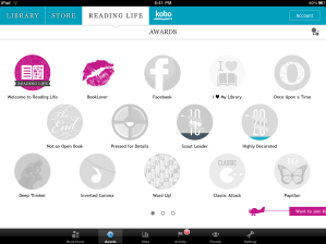
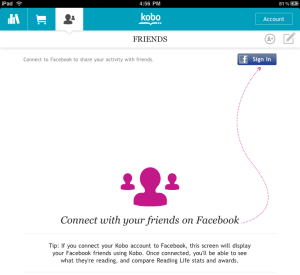
I saw a great example of gamification and feedback loops in the iPad app Kobo. Kobo is an alternative to iBook. Unlike iBook, Kobo has integrated a concept called “Reading Life” that offers awards, statistics, and images to share in my social networks 
Kobo tablet screenshots- from OhGizmo
I immediately called my friend and asked her to get Kobo on her iPad so we could both use it and see who reads the fastest (a little competitive spirit going on). Then I sent a link to another friend- encouraging her to use it too. Then I bought some books and will shortly post my Bookcover on Facebook.
Compare this to Audible’s Stats (timer, achievement awards and badges), which leave me feeling under-motivated. I mean, I’ll use the app and all, but I’ll never intentionally open the Stats screens again.
Kobo and Audible are both using gamification techniques to encourage specific behaviors (buy more books). So why is Kobo getting me to change my behavior and Audible isn’t?
- Audible has a bug and isn’t pulling in any of my hundred of stories I’ve bought over the past few years. So the feedback loop that might encourage me to “level up” isn’t working because the data is bad (I’m not an AppNewbie).
- Kobo started me off with some badges already earned (good for me!), Audible has me at 0 out of 15 (lame-o).
- The stats in both apps stay up to date to reflect my reading/listening patterns. Audbile only has one stat, listening time, whereas Kobo offers lots of interesting information.
- Most importantly: Kobo tapped into not only how I read (pages per hour), but how reading is a part of my life. I’m in a book club, I share my favorite titles and authors with friends, I read out loud to my kids, my mom and I bond over books. With Kobo’s “Reading Life” I can now easily share what I’m reading with my circle of friends and family.
Please share other example of apps using gamification and feedback loops effectively, or examples of ones that failed.
End to End Experience Design
UX Magazine published my most recent article, End to End Experience Design today. Take a look, it has lots of pictures and even comes with a helpful checklist:
Thank you to Pascal Raabe for the great design.
Comments off
The Multi Select Solution
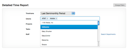
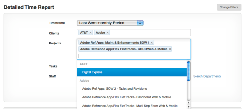
Harvest, the time tracking and invoicing tool we use, just added a new filter mechanism to their report generator. While I appreciate the additional functionality, I was most impressed with their multi-select combobox. It looks like a normal text field, but once the field has focus you can select any option and it will be added into the field, click again and you can select another option, building up any number of options. The field just gets larger (more rows are added) when you add more options than can be displayed in a single row.
It is equally easy to remove items from the field by clicking the little ‘x’ next to each option.
Does anyone know if there is a JQuery control for this? That would be awesome. A Flex control like this would be nice too, just in case there are any motivated developers reading this (wink, wink)…
Flex 4.5 for Apple iOS, Google Android, and Blackberry
We’ve been working with Adobe since last year to design and develop a showcase of reference applications for Flex 4.5 and Flash Builder 4.5. This has been an amazing project from a design and development perspective, designing for multiple form factors, and coding with the new SDK.
Read more here:
Just a year after Flash Builder 4 and Flex 4 SDK were released, new versions are available with Flash Builder 4.5 and Flex 4.5 SDK! The main focus for Flex 4.5 SDK and Flash Builder 4.5 is the ability to build mobile applications that target the Google Android, Blackberry Tablet OS, and Apple iOS operating systems. Additionally, Flex 4.5 SDK introduces new Spark components and improvements for large application development while Flash Builder 4.5 introduces dozens of new coding productivity features for faster ActionScript and MXML development.
Shopping Cart
Expense Tracker
Sales Dashboard
Comments off
Our Patterns in Print
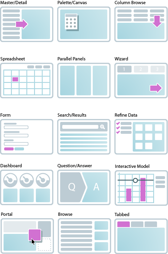
After our book release in January 2009, we posted an article on 12 Standard Screen Patterns. It went viral with hundreds of thousands of readers. Two years later, it still gets 1,000+ readers each week.
In 2010 we updated the screen patterns, including a few more and all new examples: RIA Screen Layouts. With more than 40k views on Slideshare, it seems to be pretty popular.
And now they are in print too! Three books this year included our screen patterns as the way to solve common UI problems:
- Designing Interfaces: Patterns for Effective Interaction Design- Second Edition by Jenifer Tidwell, O’Reilly Media 2011
- Smashing Book #2, Smashing Media GmbH 2011
- Professional Web Design: The Best of Smashing Magazine, Smashing Media GmbH 2011
Comments off
