Top Ajax Technologies and RIA Frameworks

New article on InsideRIA this week:
Top Ajax Technologies and RIA Frameworks
I posted a fairly comprehensive list of RIA frameworks and Ajax technologies rated on:

  • Completeness of their UI control set, based on the list of essential controls
  • Usability of the controls
  • Aesthetics, based on the default visual design of the controls

I also included some examples of applications built with the top frameworks and technologies. Please check it out and share other technologies you have used and/or applications developed with these technologies.

Comments off

Interesting Moments Grid in the Wild – Zurb Bounce App

In our book and often in our talks we discuss a technique for thinking through and documenting detailed interactions in a user experience. Just arrange the interesting moments in a grid. List the “actors” (user interface elements) vertically and the events horizontally. The cells in the grid become the interesting moments.

With the classic example from the of drag and drop there are at least 96 interesting moments (6 actors X 16 events = 96 interesting moments).

BounceApp Annotation Interaction

About a month back I gave a talk at Zurb, a northern California design firm, in which I discussed this technique. On Friday I was pleasantly surprised to see they had already taken the idea and used it in a new product they announced last week — BounceApp — which was featured on TechCrunch.

Check out their article on 110 Interactions for Editing Annotations on Bounceapp.com.

Nice application of the grid.

Comments (3)

Designing with Patterns: Sketch Notes

Lucy Spence did a great job capturing Bill’s Designing with Patterns workshop at UXLx in Lisbon.

Check out her whole set of sketch notes from the conference on Flickr.

Comments (1)

Designing Web Interfaces Workshop Video Available (HD)

A couple of months back Theresa Neil & I filmed a combined workshop on the material from Designing Web Interfaces plus Theresa’s material on application patterns, screen patterns and ui controls.

This is a beautifully recorded workshop by O’Reilly Media filmed at the Images in Motion Studio in Sonoma. The workshop is over 4 hours long and broken down into 11 smaller, digestible segments. A full camera crew, HD video and lots of great post production conspire to create a video series I am proud of.

Here is a sample of the material posted on youtube.

To appreciate in all of its HD glory visit our video site on O’Reilly Media. The full 4 hours is only $79. You can get it and show it to your whole team.

Comments off

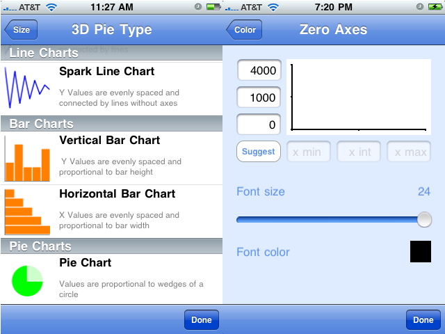
Mobile Chart Options

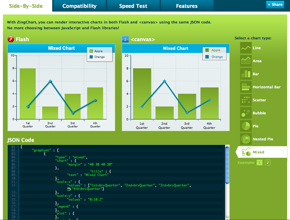
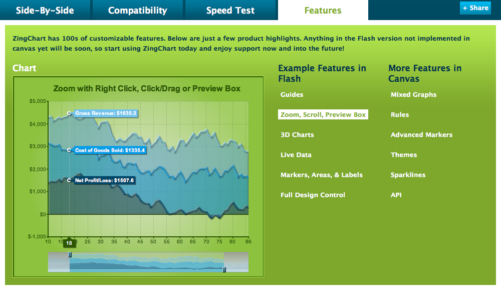
Check out this promising beta by ZingChart, HTML5 Canvas.


This advanced Zoom, Scroll, Preview is very well designed and implemented.

They also have sparklines, which are microcharts used to convey the “shape” of data, not necessarily all the details a full size chart would include.

ZingChart also offers a Speed Test example, which I think is pretty cool for helping non-super-techie people like myself understand which factors can influence chart loading times.

Other HTML5 Canvas Chart options

01. RGraph
02. jQuery Visualize Plugin
03. PlotKit

Mobile charting libraries

01. KeepEdge
02. CorePlot

03. s7graphview

04.Google Chart Tools

Android specific

01. aiCharts v1.5
02. Java [TM] Charts for Android

iPhone/iPad specific

01. Mobile Charts- a GUI for the Google Charts API

02. Drawing and Graphics with UIKit and Quartz (instructions) (Quartz demo) (Quartz2D programming guide)

03. SM2DGraphView (Cocoa)

Symbian specific

01. PySChart v0.3

Windows Mobile specific

01. TMS Advanced Mobile Chart Warning- this may be the ugliest chart library I have ever seen; hopefully it can be styled
02. ComponentOne offers 2D charts for apps in their Mobile Studio

For Mobile devices that allow Flash, I would suggest browsing through these lists:
28 Rich Data Visualization Tools
List of Data Visualization Tools
75+ Tools for Visualizing your Data, CSS, Flash, jQuery, PHP

Please comment if you have found other charting options that work well for mobile sites and apps.

Comments (5)

Design Lenses Article

A design lens allows you to view your user experience design from the perspective of a single design principle. Lenses were originally created for game design but are just as powerful for user experience design.

I recently started documenting lenses that I find useful on a new site, Designing with Lenses. Though it only has 3 lenses to start with, we have more that will be posted there in the months ahead.

To get the whole scoop, go read the introductory article Designing with Lenses over on UX Booth.

This article is part of a series of posts written by the speakers of UX Lx, The premier UX conference in Lisbon, Portugal; happening on May 12th–14th. There’s a great lineup of speakers and Portugal is absolutely beautiful, so head over to the conference site. You can enter UXBOOTH2010 for a 10% discount.

Comments off

Ultimate guide to table UI patterns

Check out this excellent article by Janko: Ultimate guide to table UI patterns. It is full of great examples and suggestions.

After reading it, I just had to add three more scenarios:

1. Inline Editing


Quicken Online allows simple editing with a pull down for more advanced editing.


Mint.com does the same.

The Ajax framework Ext JS and Ext for GWT offers a pre-built Grid row editor component. Try out the demo. This would work well for tables that are primarily read-only but might need to be edited. This design is not for heavy data entry.


For heavy data entry, use a design like Harvest. They offer a simple grid layout that keeps a live total and provides a Save button for saving all the entries once the person is done (it also auto saves periodically).


Google Docs is an online spreadsheet application with inline editing. It also has a Save button for the whole spreadsheet, as opposed to per row updates.

Inline Editing Best Practices

  • Implement tab navigation when you create a table with inline editing.
  • Consider how to handle errors, such as highlighting rows or cells with errors in a way that is easy for a person to correct the issues. Don’t break the person’s data entry flow by locking them in a cell with an error, simply highlight the cell with the problem and provide a way for them to return to it later to fix it.
  • Offer undo and redo functionality.


Swivel is an app that acts a lot like Excel and provides cell specific error messages.

2. Super Wide Tables

I received an email last week asking me about super wide tables. The email said “I’ve come to the conclusion that breaking them up into smaller chunks is maybe the best way to go, rather than going with a horizontal scroll-bar that goes on for days.”

Based on a lot of design work Bill Scott and I did for the airline industry, I would instead propose instead applying these principles:

  • Organize the most important columns to the left.
  • Experiment with frozen/fixed columns, so if the person does need to horizontally scroll, they can keep context.
  • Only show a set number of columns in the default view (so there is no horizontal scrolling in the default view) and offer a Customize option so the person can choose to hide or show more columns. ExtJs has this built into the column dropdown; I usually add a customize button to the table toolbar with Hide/Show column functionality.
  • Offer resizing of columns.
  • Offer rearranging of columns.
  • If you have a table with some columns editable and other read-only, group editable with editable, read-only with read only.
  • Don’t abbreviate column titles, reduce spacing or padding, or drop to a smaller font to fit your table on the screen. That won’t help anyone use your app.
  • Try out fat rows like this example from Survs. Instead of having a column for title, created by, created on, last updated on, all of that information is in the second column. Good visual design can help organize the information in a more meaningful way which makes your data easier to scan.
  • Use a summary row to chunk the data if appropriate. I know this won’t make your table any narrower, but it might make it more readable.
  • Consider putting a visual summary, or roll-up, above the table so the person can make sense of the data visually before diving into a huge table of numbers.

  • Discover Spend Analyzer offer a dual purpose summary and filter above the rows of transaions. Play with the demo to try it out.

    Swivel example

3. In-column Filtering

The example included in Janko’s article has dynamic filters above the table (dynamic meaning, when you make a selection, it dynamically updates the table content- without an extra submit action).

In some web applications, like heavy productivity applications or enterprise apps, in-column filtering is a powerful option to offer. It is pretty easy to implement with Flex or Ajax. Just validate the need for this type of functionality with your customers; it could be overkill for people who just need simple filtering.

Example from Zenoss Open Source Server and Network Monitoring

Try this at Telerik RadControls. This example requires a click on the filter button in the column, and has the option for selecting a specific way to apply the filter.

Play with SmartClientRIA, where the implementation ( they blank out the whole content area while filtering) makes it seem slow.

And a Flex example, where clicking on the filter icon lets you search in that specific column, and then you can further refine by filtering other columns.

Make sure you take a look at Janko’s original article : Ultimate guide to table UI patterns.

Comments (23)

Screen Layouts for Rich Internet Applications

Last year we posted an article on 12 Standard Screen Patterns. It has been incredibly popular so we updated it for 2010. The full article will be published at UX Magazine. In the meantime, take a look at the 15 standard layouts and examples from more than 80 current RIAs:

Comments (14)

Essential Books for User Interface Designers

If you are looking to stock your library, you can’t go wrong with this list of books. These are the books that are literally on my desk, listed in order from top of the stack to the bottom.
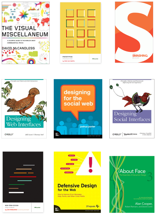
The Visual Miscellaneum: A Colorful Guide to the World’s Most Consequential Trivia

By David Mccandless

If you are a fan of Edward Tufte, you need this book. If you don’t know who Tufte is, you need this book, and all of Tufte’s books. It is chock full of ideas for visualizing data in more meaningful ways. This is on the top of the stack because I just got it- it is quite lovely.

Prototyping: A Practitioner’s Guide

By Todd Warfel. Rosenfeld Media, November 2009.

These concepts completely changed the way we do business. Full of real examples of how to use different popular tools for prototyping. this is # 2 in my stack because I had to look up some information about prototyping with Fireworks this morning.

Smashing Book

The book is available exclusively from Smashing Magazine. This book looks at Web design rules of thumb, color theory, usability guidelines, user interface design, best coding and optimization practices, as well as typography, marketing, branding and exclusive insights from top designers across the globe. Oh, and one of my applications, OtherInbox, is in the first chapter!

Designing Web Interfaces: Principles and Patterns for Rich Interactions

By Bill Scott and Theresa Neil. O’Reilly Media, January 2009.

Yeah, I know this is our book, but it really is on my desk. I use it for reference at least once a week. I had to look up ZUIs, zoomable user interfaces, earlier this week for a project.

Designing for the Social Web

By Joshua Porter. New Riders 2008.

Great, great read. Worth every penny because it is full of practical advice. Make sure you also look at Joshua’s talk on SlideShare: Designing for Social Interaction. I don’t necessarily refer to this book every day, but I recommend it to at least five start-ups a week.

Designing Social Interfaces: Principles, Patterns, and Practices for Improving the User Experience

By Christian Crumlish, Erin Malone. O’Reilly Media, September 2009.

“This book is a fairly exhaustive catalog of most UI patterns in place today with sites that integrate social networking. There are some very interesting discussions about each pattern, when to use it and who uses it. ” from an Amazon review. I need to pull this book out of the stack and take it with me on the plane next week.

Web Form Design: Filling in the Blanks

By Luke Wroblewski. Rosenfeld Media, May 2008.

Anyone who designs anything for the web needs a copy of this. It makes it so nice to not have to think about designing forms. I can spend my time on more interesting design challenges. This book doesn’t leave my desk.

Defensive Design for the Web: How to improve error messages, help, forms, and other crisis points

by Matthew Linderman and Jason Fried

Let the 37signals team show you the best way to prevent your customers from making mistakes, and help them recover for errors if a mistake does occur. This book doesn’t leave my desk either.

About Face 3: The Essentials of Interaction Design

By Alan Cooper. Wiley 2007.

Learn the rules before you break them. Please. Pretty please with a cherry on top? Get this book and read it if you are responsible for designing anything more than a simple web site. Good for Flex developers and Ajax developers as well. Lots of patterns that can be extrapolated for Rich Internet Applications.

Comments (18)

28 Rich Data Visualization Tools- Sneak Peek

Look for the upcoming post (Thursday, Dec 10) in InsideRIA.com about 28 Rich Data Visualization Tools. I’ve included the first three to whet your appetite.

Ajax.org

Ajax.org Platform is a pure javascript application framework for creating real-time collaborative applications that run in the browser.

AjaxOrg.png

AnyChart

AnyChart is a flexible Flash based solution that allows you to create interactive and great looking flash charts.

Axiis

Axiis is a Data Visualization Framework for Flex. It has been designed to be a concise, expressive, and modular framework that let developers and designers create compelling data visualization solutions.

Also, take a look at the nice window-in-window design on the saturnboy blog.

Comments (3)