Designing for Interesting Moments Talk

I posted this on my personal blog and according to slideshare it is the top tweeted presentation from their site today (9/20/09). Been meaning to post it here for those who don’t follow my blog. The material contains some new examples but tracks with the book’s six principles.

I recently gave this talk at Microsoft for their UX team, at the Ruby Meetup Group at the CMU campus in the bay area and most recently at the Ajax Experience in Boston. Next time I will be giving this talk is in December at the Rich Web Experience (first week of December) in Orlando, Florida.

Comments (1)

Two Anti-Patterns: Geek Speak & Needless Fanfare

Over on my other blog (looksgoodworkswell) I posted two examples of Anti-Patterns that relate to our book.

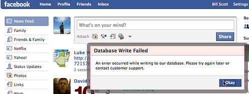
The first is Geek Speak. Presenting the user with jargon they will not understand (usually when something goes wrong deep in the bowels of the software). This example is from Facebook.

facebook-database-error (by Designing Web Interfaces)

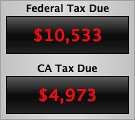
The second is an example of Needless Fanfare (which we write about in the book). Unnecessary animation/transitions that instead of reinforcing communication needlessly distract from the job at hand. Turbo Tax weighs in with their version of the Biggest Loser scale when they recalculate your taxes on the fly.

Needless Fanfare - Turbo Tax Suspenseful Recalculation (SloMo) Read the full discussion on Geek Speak and Needless Fanfare over on my blog.

Comments (10)

Foreword by Luke Wroblewski

We were honored to have Luke Wroblewski write the foreword for our book. Luke is the Senior Director of Product Ideation & Design for Yahoo! where he leads the design for yahoo.com, My Yahoo!, Yahoo! Buzz and other popular Yahoo! sites.

You can read the Foreword he wrote for our book on his blog site.

Comments off

Screencasts Added to Flickr

I just uploaded around 390 screencasts to the Flickr Designing Web Interfaces photostream. These are movie captures of various sites illustrating patterns from each chapter. This makes a nice supplement to the hundreds of figures that are already on the site.

The screencasts are in the DWI: Screencasts collection and organized into Sets that represent each chapter of the book. For example if you are looking for examples for Chapter 13, Lookup Patterns then the Set Chapter 13 (SC) – Lookup Patterns contains 70 screencasts illustrating various lookup patterns.

Comments (8)

O’Reilly Webcast Presentation Available

I presented Designing Web Interfaces on the O’Reilly Webcast today. Almost 1400 people signed up and the actual attendance hit 862. We set the record for an O’Reilly webcast :-) And we had overwhelmingly positive responses to the talk. If you liked the talk & the material then I think you will enjoy the book.

If you did not hear the webcast, check out the slideshare presentation below. It will give you the best flavor for what our book is about (keep in mind much more is in the book with lots more details and guidelines).

The audio will be available in a week or so. Look for a post here when I get the audio to share.

**UPDATE. The actual video & audio of the screencast can be seen on YouTube. Watch it in high resolution.

Comments (12)

Page Slide: Other Examples and Variations

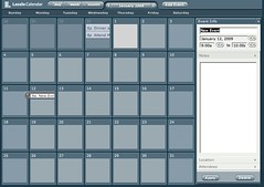
After posting about the Page Slide pattern, I realized there were a few other good examples from the book as well as an another example from Laszlo’s Demo Calendar App that Theresa pointed me to.

Dialog Inlay Variation

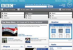
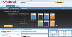
Both the BBC and My Yahoo! use a variation of the Page Slide to bring in customization controls for their home pages. In our book we call this out as a Dialog Inlay. In contrast to providing an Overlay (popup) content can be slid into the context of the page. Note in both of these examples the sliding is vertical from the top of the page (although note the banner stays in place).
dwi_0601b (by Designing Web Interfaces)

The BBC Home Page uses a PageSlide to let you configure content settings
dwi_0603 (by Designing Web Interfaces)

My Yahoo! also uses a PageSlide to let you add content or change appearance

Slide by Squashing

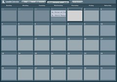
Laszlo provides an interesting variation to the Page Slide. Instead of sliding the calendar off page to accomodate the new area, it resizes the calendar so that there is room for the additional controls. This deals with the earlier problem we raised of losing context. With a calendar we need to see the whole month, but it is most likely acceptable to resize the calendar to accomodate.

slidein_laszlo_normal (by Designing Web Interfaces) slidein_laszlo_expand (by Designing Web Interfaces)

Laszlo resizes the calendar area in real-time as it slides in the controls from the right

Comments off

Bill’s Two Upcoming Webcasts

On Tues, Feb. 3rd I will be presenting a short talk on Designing Web Interfaces as a webcast for O’Reilly. This talk is free and space is limited (and filling up fast), so if you are interested sign up now.

And a reminder on a completely different (brand new) talk I will be giving on Feb. 26th: Bringing Design to Life: What Every Designer Should Know about Interface Engineering. This talk comes out of my longtime experience bouncing between the design & engineering worlds and in particular lessons learned at Yahoo! and Netflix. This 60-minute webinar is initially available as a live class, and then is made available in a DRM-free recorded, edited format. By avoiding the travel required in attending a physical seminar or conference, you save money and reduce your impact on the environment. You are free to watch the webinar with colleagues in a conference room, making for an even better value. The cost is only $129.

Details here:

Comments off

Welcome! Upcoming Articles…

Welcome to the official blog for the Designing Web Interfaces book (on store shelves starting Jan. 30th).

The purpose of this blog is to expand the book’s coverage on rich interactions. Here we will be presenting articles specifically related to design patterns (both good and bad—anti-patterns), best practices and real-world examples from around the Web.

In the next few weeks Theresa will be posting a three-part series that contains supplemental material (not found in the book) that has been helpful in her practice.

  • Part 1: Standard Screen Patterns
  • Part 2: Essential Controls
  • Part 3: Components for Common Features

Comments (2)