6 Tips for a Great Flex UX: Part 3
By Theresa Neil
Since the book focuses on rich interactions, I want to spend some time on Adobe Flex/AIR.
These tips are based on the best Flex resources I have found, and how you can use them to craft a great user experience. This is part 3 of 6:
- Play With It: 10 Explorers & Galleries
- Learn From the Best: 10 Great Flex Apps
- Learn From the Rest: 10 Great RIAs
- Stock Your Toolbox: The Essential Controls
- Review Best Practices for Designing a RIA
- Avoid Common Mistakes: 10 Anti-Patterns
Learn from the Rest: 10 Great RIAs
Take a look at some of the best RIAs on the web. How did I decide these are the best? I reviewed numerous applications, basing the evaluations on Jakob Nielsen’s 10 Principles for User Interface Design:
Feedback — Metaphor — Navigation — Consistency — Prevention — Recognition — Efficiency — Design — Recovery — Help
I realize these guidelines are a bit old (from 1990!)- but all applications should meet these guidelines at a minimum. The applications listed below also embody our 6 Principles for Rich Interaction:
Make it Direct — Keep it Lightweight — Stay on the Page — Provide an Invitation — Use Transitions — React Immediately
01. CrazyEgg
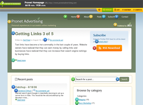
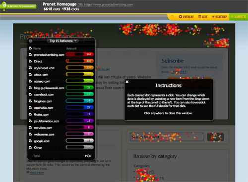
Fantastic application which adheres to every one of the principles. At first, I thought the confetti feature was going to ruin the evaluation, but it is a perfect balance of innovation and usability. Look at how they use common checkboxes for selection, and wiggle the confetti when a source is added- very rich, very nice.
Interactive demo is available
02. Mint
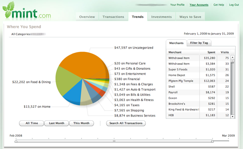
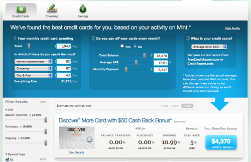
Mint’s user experience only gets better and better. You may want more features in the product (money market support…), but the features they offer are perfectly executed. Primarily developed with HTML, CSS, JS and Ajax, they chose to incorporate Flex in the Trends section.
The new Ways to Save section is completely dynamic, updating as you adjust amounts, scores and preferences.
Free registration is available
03. Wufoo
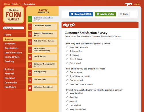
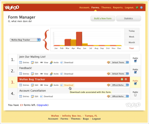
Wufoo is an extremely well designed tool that has more than meets the eyes. Play with the templates and report creator for inspiration in keeping it simple, and look at they way they use Blank Slate and Help Tips to keep you moving towards your goal. It is almost even fun ![]() )
)
A nice product tour and free plan is available
04. 280 Slides
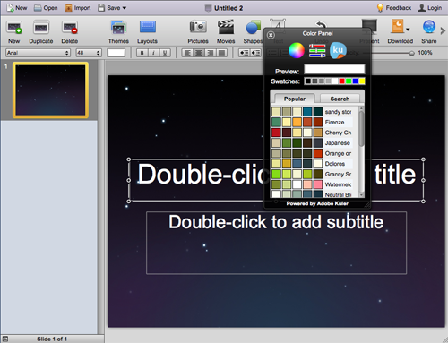
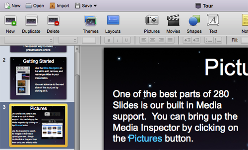
One word- slick. If only all of my projects could be this perfect. Yes, it seems like Keynote (or PowerPoint) on the web, but take a closer look at some of the features. Instead of the maddening Inspector and Format menu, the common formatting functions are in the toolbar. Everything is there when I need it, they even incorporated Adobe Kuler in the color palette!
Free trial available
05. Action Method
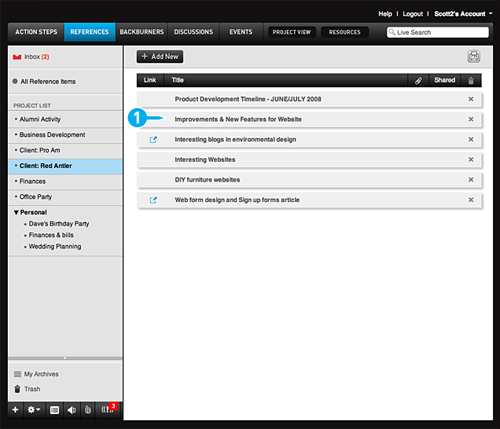
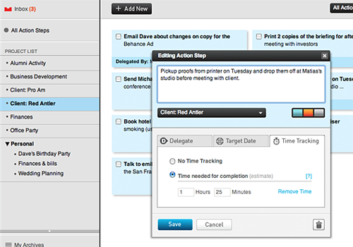
Another very well implemented product. It is easy to get started with the Blank Slate screens providing tips and directions, and even easier to get comfortable using the product because it uses a standard screen patterns and common controls.
Every detail has been accounted for. Notice the visual design that makes it clear that the tasks can be dragged around and reordered.
Trial version available
06. Fidelity Labs
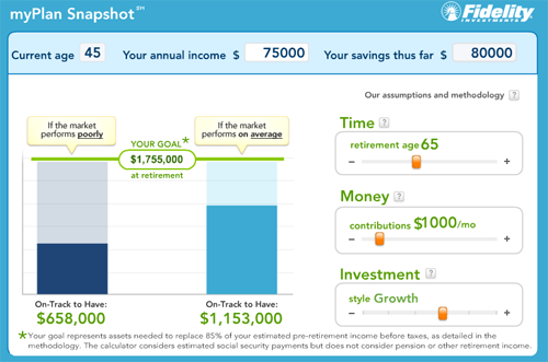
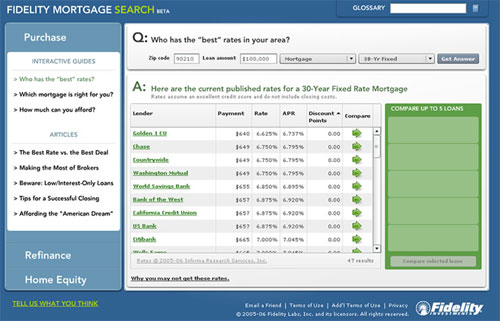
In 2006 Fidelity Labs started cranking out some very nice RIAs, one of them being Fidelity MyPlan. The Mortgage Search and Homes Sold were also very nice, but have been retired. Unfortunately, their newest 3D Portfolio Analyzer, is not up to par with their earlier beta products.
The direct interactions and what-if scenarios in MyPlan seem to have inspired Discovers Paydown Planner and other direct manipulation financial planning tools.
Fidelity MyPlan is publicly available
07. Pandora
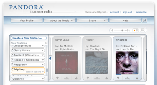
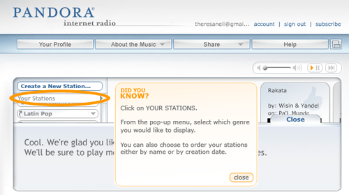
Pandora has been around since 2005 and has finally gained popularity. It has a very simple, intuitive interface, which makes it easy to get started. The menu offers direct interaction for rating the song ‘up’ or ‘down’, while also providing advanced options such as “don’t play this song again for a month”. And the help tips, shown at just the right time in the workflow, provide a glimpse into advanced features.
Pandora is publicly available
08. Wave Maker
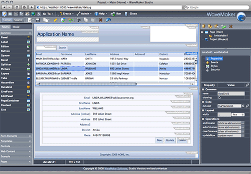
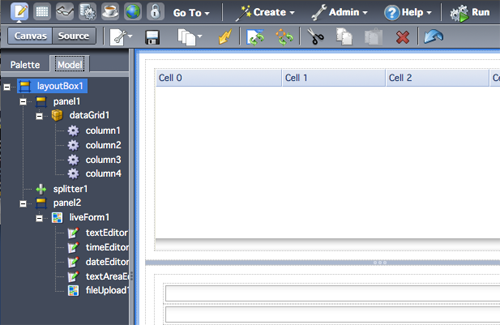
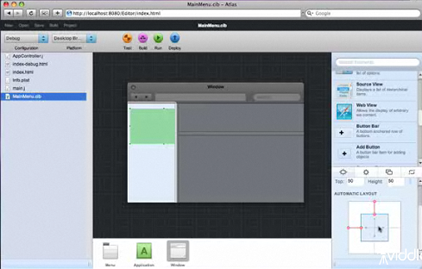
Wavemaker is a great example of how a complicated product with many features can be clarified with good interface design. They use a logical page flow from left to right- matching the developer workflow of adding a control to the canvas (LEFT) , physically manipulating it (CENTER), then entering tweaking the details in the properties and style panel (RIGHT).
A Cloud Edition is available
09. SugarSync
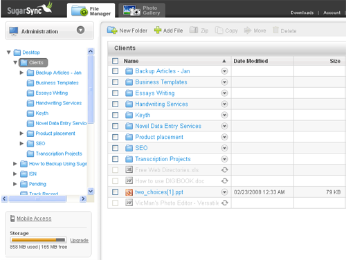
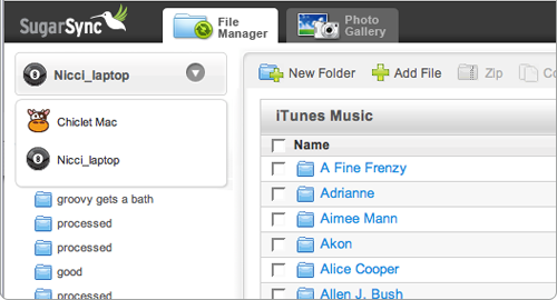
Another great product that relies upon standard screen patterns and common controls to create an intuitive efficient experience. Awarded Top 10 User Interfaces of 2008 by Jakob Nielsen. Report available for purchase.
A 45 day trial is available
10. clickshirt
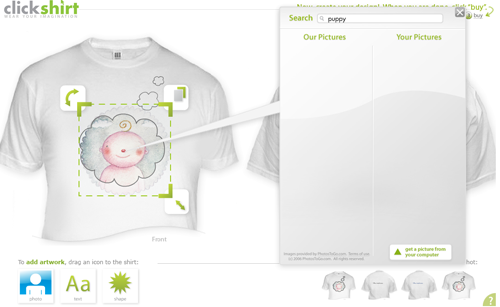
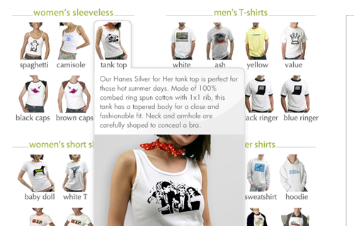
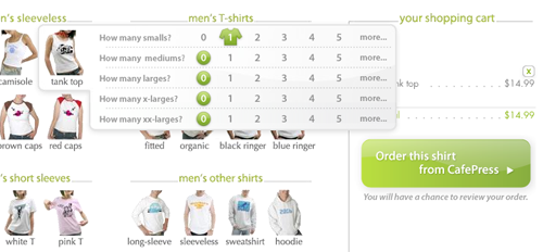
clickshirt keeps it simple and fun with integrated demos and lively interactions. Event the checkout is rich, hover to see more details about the t-shirt type, click to specify the size and quantity. No gratuitous paging in this application.
clickshirt is publicly available
More Good RIAs
These products have good examples of rich usable components, although they may not have met the 10 basic principles for usability throughout the whole application.
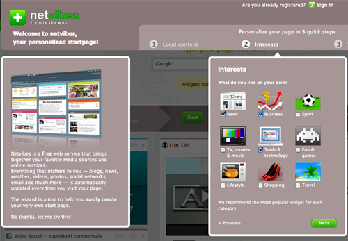
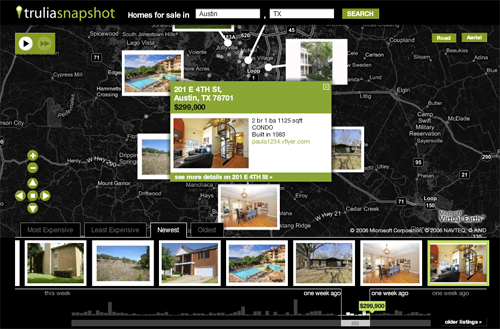
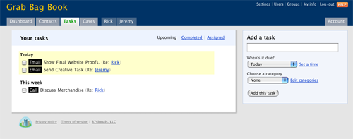
37signals products like Highrise
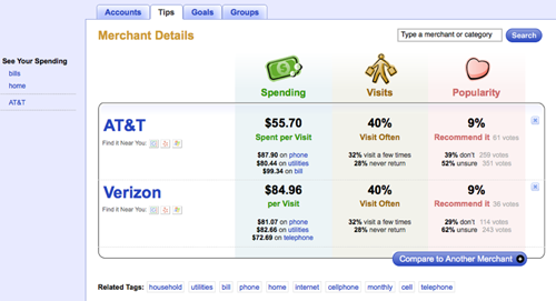
Keep an Eye on These
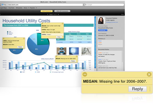
iWork.com Publishing Tool
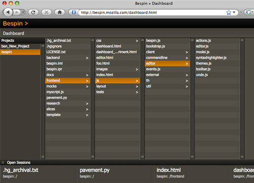
Comment with your favorite RIA
I realize I have only skimmed the surface here, please comment with a link to the best RIA you use.
Thanks to Rob Jones and Greg Leppert for helping me pull together this list.
Troy Gilbert Said,
March 4, 2009 @ 9:09 am
Maybe I’m a bit biased because I designed and developed it, but I quite like the way we used Flex for Mockingbird (http://playmockingbird.com/), particularly our Designer app (http://playmockingbird.com/designer).
Yep, that’s all Flex components under the hood, (almost) everything custom-skinned to keep the site entertaining and as little like a “tool” as possible.
Similarly to WaveMaker, our workflow progresses from left to right, with your palette of objects on the left, design area in the middle, and tweaks on the right. We also provide several “drawers” at the bottom where users can retrieve objects to add to the workspace.
The big chore was to keep everything on one screen… without using common tool-like elements like menus.
Did I mention we didn’t want it to look like a tool?
Great blog… look forward to reading the book!
Adobe Flex User Group Hamburg » Wertvolle Tips für die Gestaltung einer coolen Flex / AIR Applikation Said,
March 5, 2009 @ 4:44 am
[...] Learn From the Rest: 10 Great RIAs [...]
優れãŸFlex UIã®ãŸã‚ã®ï¼–ã¤ã®ãƒ’ント at basilication Said,
March 11, 2009 @ 11:28 pm
[...] Explorer Part2: 良ã„ã‚‚ã®ã‹ã‚‰å¦ã¶ – 10ã®ç´ 晴らã—ã„Flexアプリケーション Part3:          – 10ã®ç´ 晴らã—ã„RIA Part4: テクニックをãŸã‚よㆠ– å¿…æºãƒªã‚½ãƒ¼ã‚¹ Part5: [...]
Kyle Murphy Said,
March 18, 2009 @ 8:00 pm
Just finished the book today and decided to check out the website. I’m looking forward to seeing more great content like this!
raymond Said,
March 25, 2009 @ 7:38 am
These UX designs are looking great! I’m planning on using some of these techniques with the Raxan PDI framework:
http://raxanpdi.com
Keep up the good work.
Cristian Pascu Said,
April 13, 2009 @ 12:17 am
With FlairBuilder, I also tried to get as much as possible out of Flex, a very capable technology.
I tried, and most of the time managed, to implement some of the most common design features in this wireframing tool. You may give it a try online at http://www.flairbuilder.com/demo .
Cheers,
Cristian
Mike Said,
April 27, 2009 @ 11:52 am
Anyone check out Convos? They’ve got a nice Flex UI.
http://www.convos.com/
6 Tips for a Great Flex UX: Part 3 Said,
September 4, 2009 @ 10:36 pm
[...] Read the original post: 6 Tips for a Great Flex UX: Part 3 [...]
Websites with Flex Components « NIM ReFLEXtions Said,
October 28, 2009 @ 2:02 pm
[...] Web RIA Examples Part 3 [...]