6 Tips for a Great Flex UX: Part 1
By Theresa Neil
Since the book focuses on rich interactions, I wanted to spend some time on Adobe Flex/AIR.
After designing several large enterprise applications for diverse clients and industries, I’ve noticed some barriers to crafting a great experience in Flex. I think these barriers arise from the relative newness of the technology (and RIAs in general), the initial focus on development over design, and the confidence that Flex can provide a great UX out of the box. But it takes a bit more to make a Flex app really shine. Fortunately, the Flex community is chock-full of talented and motivated developers who contribute amazing resources.
These tips are based on the best Flex resources I have found, and how you can use them to craft a great Flex UX. This is part 1 of 6:
- Play With It: 10 Explorers
- Learn From the Best: 10 Great Flex Apps
- Learn From the Rest: 10 Great RIAs
- Stock Your Toolbox: Essential Resources
- Review Best Practices for Designing a RIA
- Avoid Common Mistakes: 10 Anti-Patterns
Play With It: 10 Explorers
I can’t think of a better way to get your feet wet than to play with these explorers.
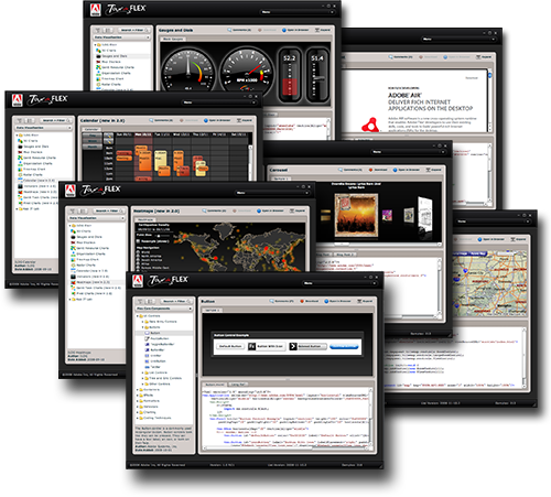
01. Tour de Flex
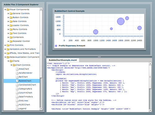
02. Component Explorer
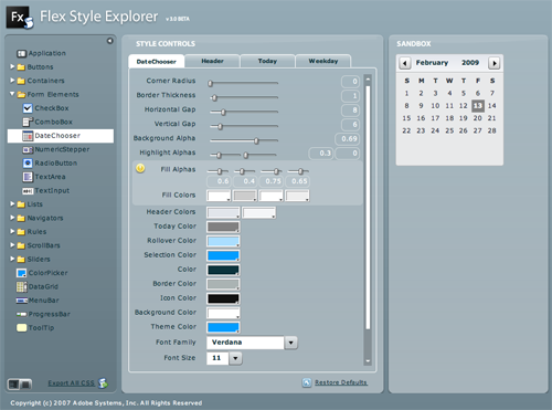
03. Style Explorer
04. Regular Expression Explorer
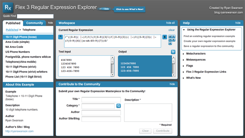
By Ryan Swanson
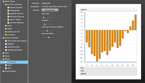
05. Charts Explorer
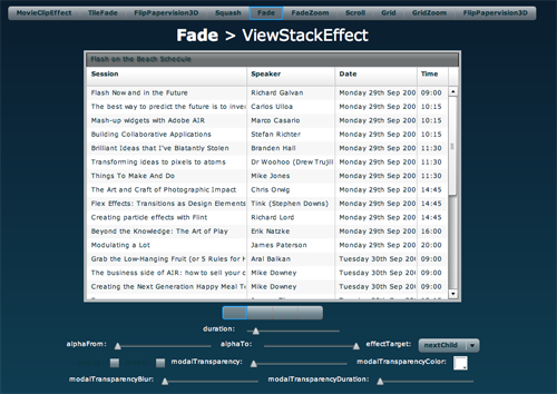
06. Efflex Effects Explorer
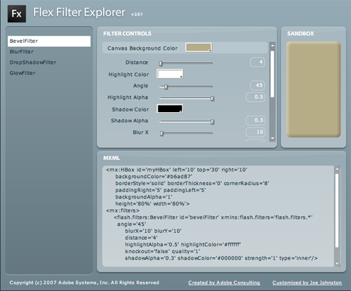
07. Filter Explorer
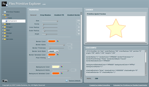
08. Primitive Objects Explorer
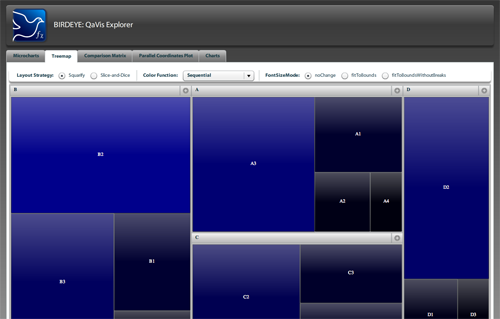
09. Data Visualization Explorer
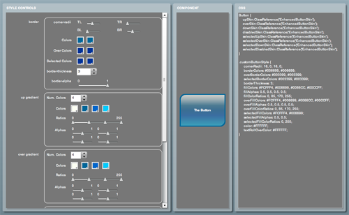
10. Button Skin Explorer
Comment with your favorite Flex explorer
I realize I have only skimmed the surface here, please comment with a link to your favorite explorer or gallery for Flex 3.
GeekyCoder Said,
February 17, 2009 @ 5:54 pm
Hi,
Hopefully someone create UIPattern Explorer to fill in the gap.
Will there be plan to include patterns for Kiosk and Mobile application as well ? I think this will be important area as touchscreen and mobile devices are becoming affordable and mainstream.
For example,
etc
HoneyComb interface in Windows Mobile 6.5
MarketPlace/AppStore for RIA, Mobile
I think it will be great if there is something like Infragistics Quince.
http://quince.infragistics.com/
Quince is useful unfortunately it runs only on Silverlight and its design isn’t optimize for collaboration and discussion.
I thinking if there is something in plan by your team that could develop something like Quince but run in HTML and optimize for idea and UI innovation sharing.
6 Tips for a Great Flex UX: Part 2 Said,
February 17, 2009 @ 8:06 pm
[...] 6 Tips for a Great Flex UX: Part 2 [...]
6 Tips for a Great Flex UX: Part 2 « Theresaneil’s Weblog Said,
February 17, 2009 @ 8:28 pm
[...] Play With It: 10 Explorers & Galleries [...]
koko8829's me2DAY Said,
February 18, 2009 @ 5:09 pm
ì—´ì´ì•„ë¹ ì˜ ìƒê°…
Flex UX를 위한 6가지 íŒ ì‹œë¦¬ì¦ˆ…
Flex Explorer Sammlung at Sascha Wolter Said,
February 19, 2009 @ 11:03 am
[...] es die Übersicht auf “Designing Web Interfaces” nur früher gegeben! Denn endlich finden sich (fast) alle wichtigen “Explorer” zur [...]
6 Tips for a Great Flex UX: Part 3 Said,
March 3, 2009 @ 1:35 pm
[...] 6 Tips for a Great Flex UX: Part 3 [...]
Mike Said,
March 5, 2009 @ 12:16 am
Those are awasome! Thanks.
6 Tips for a Great Flex UX | Konigi Said,
March 6, 2009 @ 6:04 am
[...] Tips for a Great Flex UX Theresa Neil has written a 3 part series of articles on designing great Flex user experiences. URL designingwebinterfaces.com/gre… [...]
6 Tips for a Great Flex UX at basilication Said,
March 11, 2009 @ 11:23 pm
[...] Web Interfacesã®ä½œè€…Theresa Neilã•ã‚“ãŒã”自身ã®ãƒ–ãƒã‚°ã§”6 Tips for a Great Flex UX”(優れãŸFlex UIã®ãŸã‚ã®ï¼–ã¤ã®ãƒ’ント)ã¨ã„ã†è¨˜äº‹ã‚’書ã‹ã‚Œã¦ã„ã¾ã™ã€‚ [...]
6 Tips for a Great Flex UX: Part 4 Said,
April 21, 2009 @ 8:40 am
[...] Play With It: 10 Explorers & Galleries [...]
6 Tips for a Great Flex UX: Part 3 « Theresaneil’s Weblog Said,
April 22, 2009 @ 9:50 am
[...] Play With It: 10 Explorers & Galleries [...]
6 Tips for a Great Flex UX: Part 5 Said,
May 17, 2009 @ 10:20 am
[...] Play With It: 10 Explorers & Galleries * Learn From the Best: 10 Great Flex Apps * Learn From the Rest: 10 Great RIAs * Stock Your [...]
Pattern Stuffs / Nathan Philpot. Said,
June 3, 2009 @ 9:31 am
[...] Stuffs Components, Patterns, and Frameworks! Oh My! Flex UX Pattern tap UI Patterns Search Patterns Design Patterns PreviousWebtoday Winner, [...]
Todo poderoso FLEX – Una introducción « El blog del Javo Said,
July 8, 2009 @ 11:28 am
[...] Compilación de Aplicaciones basadas en FLEX http://flex.org/showcase/ http://designingwebinterfaces.com/great-flex-ux [...]
Websites with Flex Components « NIM ReFLEXtions Said,
October 16, 2009 @ 5:35 am
[...] Web RIA Part 1 [...]
uberVU - social comments Said,
January 11, 2010 @ 7:47 am
Social comments and analytics for this post…
This post was mentioned on Twitter by dafkobyte: 6 Tips for a Great Flex UX: Part 1
Play With It: 10 Explorers
http://bit.ly/j0Hhq…
Exemplos de CSS, Template e SKins » Bruno bg + ADOBE FLEX Said,
May 19, 2010 @ 1:30 pm
[...] http://designingwebinterfaces.com/great-flex-ux [...]