Use Balsamiq Mockups to Protocast

Balsamiq Mockups new export to PDF feature opens up a whole range of possibilities for prototyping. Not only can you use the PDF with click through links for usability testing, you can also create a protocast of your designs for your clients, end users or the development team. A protocast is a prototype delivered as a screencast.

What I like to do is create a storyboard for each of the major workflows, then wireframe the screens. Link them together and then create a screencast of the happy path, narrating while clicking through the screens. My protocasts are different depending on the audience. If the audience is developers I walk through the application and discuss the flow and features, if the audience is the client or their end users, I stick to the story in the storyboard. Thanks to Todd Warfel for describing this technique in his new book Prototyping: A Practitioners Guide to Prototyping, Rosenfeld Media.

I used to do this in OmniGraffle- see example below for a reference application we designed for PayPal X. But now I can do the same thing quicker with Balsamiq!

Storyboard

The storyboard helped us nail down the two primary workflows we wanted to design for.

Protocast

This protocast was created for the developers who were coding the simulation.

Finished Product

The finished product is on PayPal X.com, although you have to login to PayPal to try the reference applications.

Comments (1)

Practical Prototyping Tips

I saw Todd Warfel speak in August at DELVE UI. I was so inspired by his approach that I changed the way we work. We have now moved away from large decks of wireframes and interaction notes- and embraced the 70% rule. We design 70% then build a prototype. There are a number of examples in my talk Designers vs Developers: Coming together to build the best RIAs. But the point is, if you are designing Rich Internet Applications, RIAs, prototyping is essential.

Check out Todd’s talk on prototyping:

And consider getting his new book, Prototyping: A Practitioner’s Guide to Prototyping, Rosenfeld Media, November 2009. It is full of practical advice and detailed examples, not philosophical musings. If you are like me- a busy consultant who is not a great programmer, but needs to get interactive mock-ups in front of stakeholders as fast as possible- there are a number of great ideas in here.

Comments (11)

Designers vs Developers: Coming together to build the best RIAs

Presented on Nov 3, 2009 at Øredev in Malmo, Sweden.

What is the fastest way to get from a product idea to a rich internet application? By breaking down the communication barriers between designers and developers.

This talk takes a quick look at how to build a shared vocabulary and use prototyping to bypass extensive wireframes and development specs.

Take a look at 5 simple and effective prototyping tools:

  • Balsamiq Mock-ups + Nakpee
  • Any wireframes + Protoscript
  • Prototcasting (using click-throughs and screencasts to convey requirements)
  • Atlas and other development environments + visual layout editors

.

Comments (6)

UI Controls for Rich Applications

In January 2009, we posted an article on the 30 Essential Controls for Rich Application design. The article was incredibly popular since it also discussed which RIA frameworks/toolkits/libraries offer each control. We will be posting a new version of the article later this month on UX Booth.

In the mean time, check out the new Control Matrix- 42 controls across 25 libraries, toolkits and frameworks like: Flex, Ext JS, jQuery, Dojo, MooTools, Google Web toolkit, YUI! 2 & 3, Telerik for .net and Silverlight, Open Laszlo and more. You can use iWork to comment on the spreadsheet if you have feedback or corrections. There is also a download button at the top of the screen (next to the printer) if you want to download the matrix.

And here are the bookmarks for the 20+ demo galleries.

And download our RIA Pattern Flipbook prototype. All you need is:

  • a printer
  • Avery 3381 Postcards/Index Cards
  • a hole punch
  • a wire ring/clip, at least as big around as a quarter

RIA_flipbook

I print a page, then flip it and print the back. The back of each card has an example from alive application.

Then I punch a hole in the top left corner of each card and pull them all on the ring. This is quite useful to keep on your desk or take into design meetings for reference and inspiration. We used them in our workshop on Designing Rich Applications at Øredev in Malmo, Sweden yesterday.

Comments (3)

iTunes Solves the Nested Clause Dillema

So the first time I ever saw a crazy rule builder was in a desktop application at Sabre in 2001. They had been around longer than that obviously, but this was the first time I was ever befuddled by a screen that looked a lot like this:
one24eleven

All I could think was there must be a better way for letting normal people set up conditional rules. So we designed something easier, and when I moved to the world of Apple, I found that they stole my design. Just kidding, but I did feel reaffirmed by my early design attempts since they were really close to the ’smart’ mailbox/album/playlist design and the advanced search feature:
Mail_Smart_Mailbox

Now, to my delight, Apple has tackled the last remaining frontier of predicate editors- the nested clause. My design partner, Jessica, found this when trying to pull together a playlist for her birthday last week.

She needed something more complex than a simple AND or OR (which Apple eloquently rephrased as “matching all of these conditions” or “matching any of these conditions”). Like only play songs:
- from the ‘World’ genre
- if the album contains the term ‘Salsa’
— that are rated 4 or more stars
— or were added after Jan 1, 2008
— or are longer than 5 minutes

iTunes_Smart_Playlist_nested clause

It turns out that Cocoa has a visual editor for editing predicates, and if you hold the ‘+’ it will turn into an ellipses, which will add a clause- but that is way to sneaky for me. A permanent ellipses button is much easier to find and play with.

And there is an Ajax library out there supporting this too. They call it the Advanced Filter. Very nice interaction design, although it could benefit from a more sophisticated visual design. Demo

If the other major RIA frameworks will add this control, we will never have to see one of these again:
clause

**As a side note- here is another post about the smarter playlist in iTunes with people responding to how they are actually using it. Good user research up for grabs.

Comments (7)

Rich Internet Application Gallery

Inspired by TapFancy- a showcase for the very best in iPhone and iPod Touch application design, we started a tumblelog to showcase the very best RIAs.

GalleRIA

The initial content is from our InsideRIA article highlighting the 50 Most Usable RIAs, but we’ll add more weekly. If you know of an app that deserves recognition, please let us know.

Comments (1)

Job Opening: Technology Leader/ UI Engineer

Posted by Theresa on October 6, 2009

I’m leading the design on a new project and we are seeking an experienced UI engineer to bring the designs to life. The front end technology has yet to be decided- so you can guide the direction.

Here is a bit about the project:

The IQVine platform will provide niche market info and customized insight at mass pricing. This is a $3B+ addressable market. We use a crowd-sourced approach with what we think is a very differentiated back-end. Our longer-term goal is a real-time collective intelligence system that can extend into other ‘long-tail’ info/advice spaces. We plan to raise capital in January.

IQVine was started in early 2009 by Scott Kwon and Jim Heerwagen, who have success with taking several concepts to commercial product in venture-backed and public companies. Our profiles are on LinkedIn. Over the Spring/Summer we did initial customer and contributor validation. Based on this we now have two seasoned N-tier architect/programmers working on the object model, community authoring tools, a proprietary real-time transaction system, and a quality filtering system to automate a good chunk of the interaction processes. A project is underway to produce a clickable prototype. And we are doing more validation and fine-tuning go to market strategy this Fall. We need a technology leader who can bridge the gap from the object model on through to pixels.

What we need:

  • Previous success as a team leader in successful startup
  • System-level web app architect
  • Hands-on development horsepower – doer, not supervisor
  • Champion of open source, agile, and lean development
  • Knack for great user experiences
  • Crowdsourcing, rec. engines, machine learning, and content mgt. a plus
  • Solid engineering education or meaty large web-company experience
  • Communicator with a sense of humor . . . life’s too short

Our tough challenges:

  • Data visualization that shows semantic structure of complex and evolving market information.
  • Real-time transaction system that converts rated community contributions into dollars.

Email me, theresaneil at gmail, if this appeals to you and I will make the introduction.
—–

Comments (1)

UX Booth Redesign & Giveaway

The nice guys at UX Booth, a blog for and by the User Experience Community, are celebrating their 1st anniversary.

Check out the blog and all of the great prizes:

Open Hallway Premium Plan

Open Hallway, a very simple usability testing solution, has offered our readers an amazing prize! We have a 6 month subscription to their Premium Plan, valued at $1,200!

Axure Single User License

Axure RP is a wireframing, prototyping, and specification tool that allows you to design applications and websites faster and easier than with your current tools. Axure has offered our readers a single user licensed valued at $589!

Theme Forest Credits

The kind folks over at Theme Forest have brought us an excellent prize to offer to our viewers! We have five $25 “forest bucks” (think the name will catch on?)!

Mail Chimp Credits

The Atlanta-based email marketing company, MailChimp, is not only beautifully designed but also an amazing email marketing tool. MailChimp does it all. Build and manage your list, design HTML emails, send emails that are sure to get through filters, and track and analyze the results.

Books from Rosenfeld Media

Rosenfeld Media publishes short, practical, and useful books and webinars on user experience design. Rosenfeld has donated some great books to help expand your UX knowledge.

Books from O’Reilly

O’Reilly Media spreads the knowledge of innovators through its books, online services, magazines, research, and conferences. You may know them as the publisher of the iconic “animal books” for software developers.

Make sure to visit their site by Oct 2, 2009 to enter in the giveaway.

Comments off

Designing for Interesting Moments Talk

I posted this on my personal blog and according to slideshare it is the top tweeted presentation from their site today (9/20/09). Been meaning to post it here for those who don’t follow my blog. The material contains some new examples but tracks with the book’s six principles.

I recently gave this talk at Microsoft for their UX team, at the Ruby Meetup Group at the CMU campus in the bay area and most recently at the Ajax Experience in Boston. Next time I will be giving this talk is in December at the Rich Web Experience (first week of December) in Orlando, Florida.

Comments (1)

Designing for the iPhone 3G: Tips and Tools

Last April I posted a simple iPhone wireframe stencil to Graffletopia, an online stencil community for OmniGraffle users. 18 thousand people have downloaded it. It is time for an update- get your new iPhone 3G Stencil here. Unzip it and put in in your Library > Application Support > OmniGraffle > Stencils folder.

I’ve also included some tips and tools I find useful while designing iPhone applications.
iPhone3G

Design Basics

Start with the iPhone Human Interface Guidelines.

Paper and Pencil Drawings

So fast, so simple. Grab a sketch pad and the iPhone stencil kit. I hope they make a magnet set next.
Physical_stencil

Digital

1. My favorite wireframing tool,Balsamiq Mockups, now supports iPhone UI elements
Balsamiq_Mockups_iPhone

2. iPlotz , another wireframing application, also provides iPhone controls
3. Try my new iPhone 3G stencil

High Fidelity

1. Mercury Intermedia’s vector images
vector_goodness

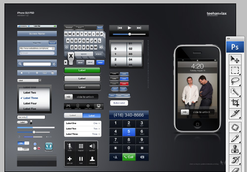
2. teehan+lax’s psd images
iphone_gui

Interaction Design

1. Download the Touchscreen Hand Gestures v2 on Graffletopia, inspired by Dan Saffer, author of Designing Gestural Interfaces, O’Reilly Media December, 2009.
touchscreen_gestures

2. Todd Warfel did a great presentation last month in NY called Prototyping in the Wild. He had some cheap, quick and fun ideas for prototyping iPhone apps- mostly involving cardboard, markers, paper and tape. Cut a life-size iPhone out of cardboard. Place it over your design sketches. Your clients or test group can flip through the screens to experience the app. Hint* add notes like “pull to left” or “slide up”, or create a Common Craft style movie to pitch the concept.
frame-02-800

3. Balsamiq Mockups can now be combined with Napkee to make working prototypes. I have not tried this for an iPhone app yet, but I am optimistic.

Best Apps Showcase

1. Check out O’Reilly’s Best iPhone Apps site for inspiration
Best IPhone Apps

2. There is a new book on the market Best iPhone Apps: The Guide for Discriminating Downloaders. I haven’t personally checked it out yet, but will over the weekend. It is bound to have some good examples in the 220+ pages.

Comments (3)