6 Tips for a Great Flex UX: Part 5
By Theresa Neil
Since the book focuses on rich interactions, I want to spend some time on Adobe Flex/AIR.
These tips are based on the best Flex resources I have found, and how you can use them to craft a great user experience. This is part 5 of 6:
* Play With It: 10 Explorers & Galleries
* Learn From the Best: 10 Great Flex Apps
* Learn From the Rest: 10 Great RIAs
* Stock Your Toolbox: 40+ Custom Flex Controls
* Review Usability Best Practices
* Avoid Common Mistakes: 10 Anti-Patterns
Review Usability Best Practices
Don’t forget the usability basics. Jakob Nielsen’s Ten Usability Heuristics are as relevant now as they were in 1999. I stress this because I looked at the Flex showcase recently, and it looks like many of the applications are not built with these best practices in mind.
1. Visibility of system status (Feedback)
The system should always keep users informed about what is going on, through appropriate feedback within reasonable time.

1.0 BaseCamp by 37signals
The upload button is enabled, until clicked. Then it is replaced with a progress indicator until the file has finished uploading

1.1 Picnik
Progress message and indicator shows while the application loads

1.2 Tick
A feedback message is displayed when an action is performed

1.3 Windows Live Account
Password strength is shown as the password is entered
2. Match between system and the real world (METAPHOR)
The system should speak the users’ language, with words, phrases and concepts familiar to the user, rather than system-oriented terms. Follow real-world conventions, making information appear in a natural and logical order.
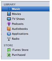
2.0 iTunes
Organized as a library that contains your media library: music, movies, shows, audibooks. Beneath the Library is the Store where you can buy more media to put in your Library.
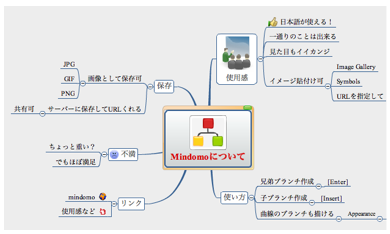
2.1 Mindomo
The branches and hierarchy of a mind map can be easily reorganized visually in a non-linear manner. An outline would never work, but this matches the paradigm exactly.
3. User control and freedom (NAVIGATION)
Users often choose system functions by mistake and will need a clearly marked “emergency exit” to leave the unwanted state without having to go through an extended dialogue. Supports undo and redo and a clear way to navigate.
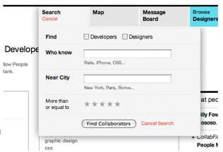
3.0 CollabFinder
Search is easy to open, enter info, execute or cancel.
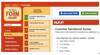
3.1 Wufoo
Clearly marks where the person is and where they can go by showing the selection in each menu

3.2 Pages (Apple’s Word Processing Product)
Cell editing shows row and column ids, and the cells used in the equation. The equation can be saved or canceled.
3.3 Balsamiq
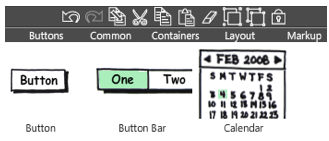
Undo and Redo buttons are available in the toolbar, and can also be accessed with the standard keyboard shortcuts
4. Consistency and standards (CONSISTENCY)
Users should not have to wonder whether different words, situations, or actions mean the same thing. Follow platform conventions.
4.0 Gmail
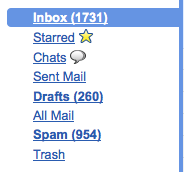
When Gmail was designed, they based the organizational folders on the same ones used in client email applications: Inbox, Drafts, Sent Mail.
4.1 Microsoft Office
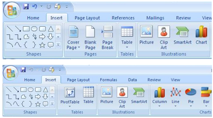
Word, Excel, and PowerPoint all use the same style toolbar with the same primary menu options: Home, Insert, Page Layout… Consistency results in efficiency and perceived intuitiveness.
5. Error prevention (PREVENTION)
Even better than good error messages is a careful design, which prevents a problem from occurring in the first place.

5.0 Yammer
Disables the update button after it is clicked, so the person cannot update the post twice by accident

5.1 Example from “Web form Design:Filling in the Blanks” by Luke W.
Make the primary action prominent with a larger click area. Cancel and secondary actions are just shown as links
5.2 Google Auto Recommend
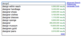
The auto recommend feature cuts down on mis-spellings

5.2 Wikpedia
Auto focus on input prevents a common source of frustration, typing only to realize nothing is displayed because the field did not have focus
6. Recognition rather than recall (MEMORY)
Minimize the user’s memory load. Make objects, actions, and options visible. The user should not have to remember information from one part of the dialogue to another. Instructions for use of the system should be visible or easily retrievable whenever appropriate.
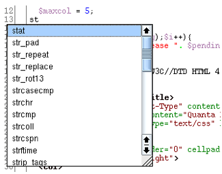
6.0 Quanta IDE
Type ahead for coding in a development environment
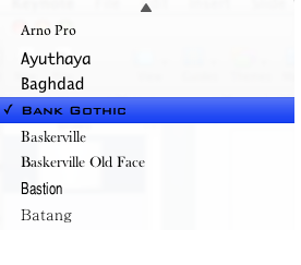
6.1 Keynote
Previews the fonts you can pick from, instead of just the font name
7. Flexibility and efficiency of use (EFFICIENCY)
Accelerators — unseen by the novice user — may often speed up the interaction for the expert user such that the system can cater to both inexperienced and experienced users. Allow users to tailor frequent actions.
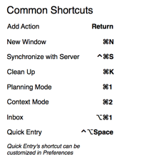
7.0 OmniFocus
List of keyboard shortcuts and accelerators
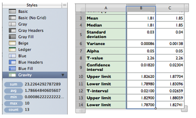
7.1 Numbers- Apple’s Spreadsheet product
Previews common function results on the left when a column is selected, more efficient that clicking on an action in the toolbar
8. Aesthetic and minimalist design (DESIGN)
Dialogues should not contain information, which is irrelevant or rarely needed. Every extra unit of information in a dialogue competes with the relevant units of information and diminishes their relative visibility. Visual layout should respect the principles of contrast, repetition, alignment, and proximity.
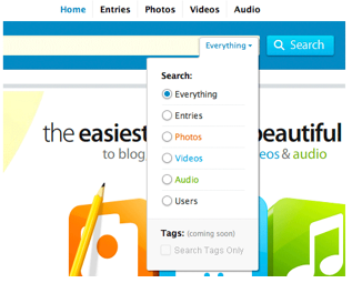
8.0 Kontain
Kontain’ search menu exemplifies the four principles of visual design:
Contrast: bold text is used for the two labels in the search
Repetition: the orange, blue, and green text match the media types
Alignment : strong left alignment of text, right aligned drop down
Proximity: a light rule is used to separate tags from the other options

8.1 Harvest
Sufficient padding and spacing keep this timesheet from being a visual nightmare. Header and footer rows, as well as the summary column use subtly different colors to indicate they are distinct from the content
9. Help users recognize, diagnose, and recover from errors (RECOVERY)
Error messages should be expressed in plain language (no codes), precisely indicate the problem, and constructively suggest a solution.
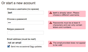
9.0 Digg
Provides immediate feedback with specific instructions
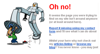
9.1 Humorous ‘ Page Not Found’ Error
Uses a funny image and copy, but provides viable alternatives (article listings and blog link) and a course of action (report it)
10. Help and documentation (Help)
Even though it is better if the system can be used without documentation, it may be necessary to provide help and documentation. Any such information should be easy to search, focused on the user’s task, list concrete steps to be carried out, and not be too large.

10.0 Picnik
Contextual help (this is an example of help in the ‘Collages’ module) tips in Picnik are clear and easy to navigate

10.1 GoodBarry
Embedded videos can be used to showcase features as well as get people started using the product
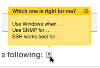
10.2 Zenoss
Help tips are displayed on hover, answering the most likely questions about a field or instructions

10.3 BaseCamp by 37signals
Help opens a new browser window/tab with a full set of help resources: search, FAQ, video tutorials, customer forums
Derick Ng Said,
May 17, 2009 @ 5:46 pm
As far as help is concerned, I think Xero (http://xero.com) has done it best. I like the fact that they have contextual help with the usual “?” icon along with a “Show help for this page” link. Also, you can contact support at any pages with regards to the current page you are at. All that without leaving the page you are on. To top that off, their documentation is very comprehensive.
Fulltext Said,
June 20, 2009 @ 2:57 pm
Please FULL TEXT RSS FEEDS
Sneak Peak: 50 Most Usable RIAs Said,
August 31, 2009 @ 3:07 pm
[...] 1: Does it adhere to the 10 basic usability principles? Number 2: Is it really rich? Developing a product with Ajax, Flex, or Silverlight doesn’t [...]
Techwave » Blog Archive » 50 Most Usable RIAs Said,
September 2, 2009 @ 6:05 am
[...] we applied two simple criteria to identify the top fifty: Number 1: Does it adhere to the 10 basic usability principles? Number 2: Is it really rich? Developing a product with Ajax, Flex, or Silverlight doesn’t [...]
Usable RIAs: The Top 50 Designs « Theresa Neil Said,
September 2, 2009 @ 9:58 am
[...] 1: Does it adhere to the 10 basic usability principles? Number 2: Is it really rich? Developing a product with Ajax, Flex, or Silverlight doesn’t [...]
6 Tips for a Great Flex UX: Part 5 Said,
September 3, 2009 @ 8:08 am
[...] Go here to read the rest: 6 Tips for a Great Flex UX: Part 5 [...]
Ken Said,
September 3, 2009 @ 9:20 am
Very cool stuff. I like the clarity and concision. Although not directly mentioned, the visual examples all have high hedonic value.
50 Most Usable RIAs - Partytow Said,
September 8, 2009 @ 4:42 pm
[...] Number 1: Does it adhere to the 10 basic usability principles? [...]
When it comes to web sites, some designers don't know Jack | Brand Central Station Said,
September 11, 2009 @ 3:23 am
[...] can view her entire article on her [...]
Partial Recall » Links for 2009-09-03 Said,
September 21, 2009 @ 10:12 am
[...] 6 Tips for a Great (Flex) UX: Part 5 [Designing Web Interfaces - May 17, 2009] – Theresa walks through Jakob Nielsen’s heuristics and identifies examples of great RIA applications that put the heuristic into practice. [...]
Usability » Blog Archive » Bogen i brug - og mere om ekspertvurdering Said,
September 23, 2009 @ 11:38 am
[...] Særligt ekspertvurderingen diskuteres ofte indenfor usability-faget, især den Heuristiske Evaluering, som ligger bag vores beskrivelse. Derfor er det også på sin plads at udvide horisonten lidt. Det kunne fx. være i disse praktiske eksempler på hvordan heuristikkerne skal forstås: http://designingwebinterfaces.com/6-tips-for-a-great-flex-ux-part-5 [...]
Twitted by iat2 Said,
December 13, 2009 @ 8:15 pm
[...] This post was Twitted by iat2 [...]
Ikbeal Said,
January 2, 2010 @ 3:48 pm
Thank you so much, good job!
Grtzz from Holland
uberVU - social comments Said,
March 29, 2010 @ 5:13 am
Social comments and analytics for this post…
This post was mentioned on Twitter by dafkobyte: 6 Tips for a Great Flex UX: Part 5
Review Usability Best Practices
http://bit.ly/nb0O…
labatterie Said,
April 25, 2010 @ 10:11 pm
This post was mentioned on Twitter by dafkobyte: 6 Tips for a Great Flex UX: Part 5
Cuisine Said,
May 13, 2010 @ 9:26 am
As far as help is concerned, I think Xero (http://xero.com) has done it best. I like the fact that they have contextual help with the usual “?†icon along with a “Show help for this page†link. Also, you can contact support at any pages with regards to the current page you are at. All that without leaving the page you are on. To top that off, their documentation is very comprehensive.
porsche mieten Said,
October 10, 2010 @ 10:02 am
Excellent article. It was nice to see those 10 principles presented in a refreshing way.
I especially liked the part about helpful error messages. There have been entire books written on the subject and you summed up everything an error message should be in one sentence: “Error messages should be expressed in plain language (no codes), precisely indicate the problem, and constructively suggest a solution.â€
Tomasz Stanisław Pelczar Said,
October 11, 2010 @ 12:06 pm
Which language can be the best to cooperate with the more advanced onltologies within RDF, OWL and higher Stanford ideas ? The JavaScript had made the good job within the actual XML and is able to recognize many xhtml cells to create the many differet “micro pages” by the different IP and http links. The VRML is not so openly used within the WWW constructions, but the more advenced libraries like OpenGL for C or Java is able to be placed within the HTML 5 standrards, VRML is able to create the beautiful graphic on the WWW, but OpenGL is better and cn be very easy implemened for those, who wanna construct the real simulation on the www or the amazing graphic within not the biggest expolring of the explorers, just addly another *.h etc if the advanced graphic can be ueful, the hologram can be created by the OpenGL just very easy and for example as a map to localize the place in the space opened on the right serwer, client-server host, this is just the possibility to avoid pendrive in the pocket and cloud computing to be more useful in the future … What can be named clarly as the Web 3.0 in the future ? Personally I don’t now right now. People like Tim Berners-Lee are able and I prefer to wait this time.